As an avid music lover, I have spent a fair few years now listening to, and mixing music in a very different light. This light came to shine as a result of me trying my hand at producing my on music using various digital studios.
Anyway, what I'm trying to get at is how the interfaces and visuals of these programmes I used changed the way I think about and 'look at' music today..
Unfortunately, once I decided to immerse myself into the realms of graphic design I ditched the music making and with it all the software, mainly due to lack of harddrive space. My next job is to ring up a few mates I know still work with this software and get a few detailed screen shots with some of the VST's, Synths and general software used.
28.12.10

First place film,
A graduation film at Bezalel, the Academy of Arts and Design, Jerusalem. This short film went on to become the winner of the 2010 Haifa film festival for best animated film.
I really like the simple, subtle use of colour and circles forming accurate geometric shapes, whilst at the same time exploring constantly re-arranging abstract compositions to form more detailed imagery.
I really like the simple, subtle use of colour and circles forming accurate geometric shapes, whilst at the same time exploring constantly re-arranging abstract compositions to form more detailed imagery.
Google demo slam.

Demo slam is essentially a mass sharing of tutorials created by anyone who feels they have a certian amount of knowledge in any given technological area. In other words, google are asking people to creatively and maybe daringly 'tech demo' anything to benefit the masses that aren't so in-the-know when it comes to modern technology. The site has endless mini tutorials and poeple sharing their skills, this particular demo however, left me rather impressed...
[MUST SEE!]
20.12.10
What is design for screen?
As part of my ongoing research into existing graphic design practice, I shall be documenting a variety of screen based design ranging from programming design through to design for television. As well as keeping these posts tagged under 'OUGD102' I shall be categorising them further into 'GDFS' (Graphic Design For Screen). I'm aiming to establish a well informed and fully linked out directory I can refer back to throughout the course.
13.12.10
Playful Type 2
Ignoring the failure of a front cover, the few shots of this book I've seen look promising. Some really interesting work going on experimenting with type and environment.


11.12.10
Typogateaux,
research cont.
A basic sponge recipie, just for referance...
- 150g butter, softened
- 150g caster sugar
- 150g self-raising flour
- 3 medium eggs
- 2tbsp milk
- Few drops of vanilla extract
- Set the oven to gas mark 5 or 190°C.
- Place all the ingredients in a bowl and beat until smooth.
- Bake in the centre of the oven for 18-23 mins, or until the cake has risen and is just firm to the touch in the centre.
- Remove cake from the oven and transfer to a wire rack to cool.
Typogateaux,
research cont.
A few more cakes, slightly more type based than the last post but nonetheless still all very impressive, a few examples are past entries to our very own typogateaux competition...


9.12.10


The ABC's of Branding,
TBP
More design work from TBP, impeccable posters printed using foil stamping and then embossed to create a beautifully composed alphabet from well known brand logos. 2 variations are availiable here, silver on black and gold on cream.


Fortune Posters


Fortune Posters by 'The Best Part'. Genius. The fortune cookie concept illustrated in poster form. There are 8 availiable, however once ordered, a random one is sent to you, keeping that element of surprise in tact.
Our current project has strongly led us to work with interesting poster designs, in our case patterned designes. We wanted to produce a folding leflet explaining our project to the public, on the reverse a poster design for the viewer to keep. These show how such a folding design could work.
What if,
Abandoned Building Art.
Georges Rousse (born 1947 in Paris) is a French photographer.
"Rousse's work, from the 1990s to today, generally appears at first glance to be photos of desolate or abandoned spaces (buildings, rooms, parking garages or streetscapes) often on their way to the wrecking ball, on which the artist has superimposed precise geometrical shapes or squiggly graffiti."


Relating to our current project in which we are looking at decorating abandoned and unsightly areas of Leeds city centre, these photos are a perfect example of truely bringing beauty into an area that wouldn't otherwise be looked at twice. This artwork also becomes relevant to a visual language session a few weeks back focusing on anamorphism.
8.12.10
Interactive Poster Designs,
For our current brief we attempted to use an interactive poster design to collect opinions from the public about what should be done with the unused and unsightly shops in Leeds. There are some extremely well thought out designs out there...


-

7.12.10
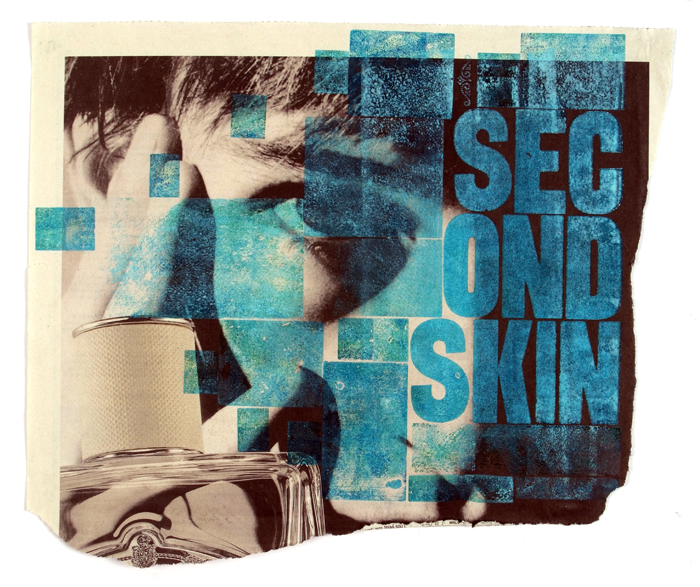
Letterpress
My printmaking elective has led me to aquire a strong intrest in letterpress, here a few rather exquisite peices I found whilst searching for abstract examples of the artform...


Michael Dacey - “welcome to the human race” – letterpress monoprint series printed with vintage wood type

-
Nick Schmitz - 3 colour wooden and metalic absrtact letterpress

-
John Worthington - Wooden letterpress on newspaper.
What if,
Research
A map showing the mount of unused shops within Leeds sity centre. We used this as a guide, choosing where to primarily base our project,


We chose the area around 'Boar lane',
evidently an area heavily reflecting the
problem in hand.
Subscribe to:
Posts (Atom)