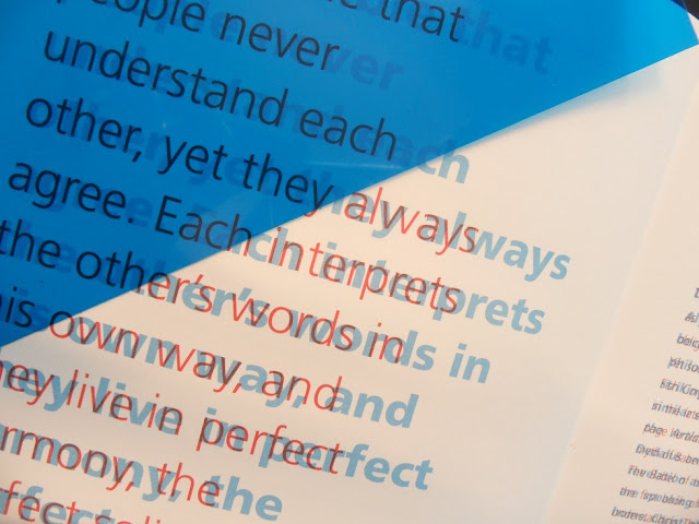
This is a book from my collection that links back to a similar post on my context in which
the same concept of overprinted text is used. The book has a heavy focus on 'communication'
and looks at various projects concerning the theme.
The use of blue and red (although missing from the book) acetate cleverly allows the same
passage written on the same page in two different fonts, to become legible in either style
placed over the page. A beautiful technique to accompany a book concerning the issue of
communication.


No comments:
Post a Comment