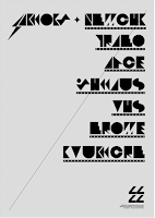
27.10.10


123Klan, a creative studio currently based in MontrĂ©al produced
these graphics to promote the BANDIT-1$M clothing collection. 
I really like the poster/flyer design here, kind of reminds me 
of some Russian constructivist works and more recently, OBEY.


21.10.10


Another simple and highly effective idea from Huvi design.
This time a conceptual redesign of cannons printer inks,
keeping only essential information on the box leaving the
rest open for pure colour.


The real beauty of this project comes to light when the inks
come to be displayed on a shop floor. The packaging then allows
itself to be arranged as graphic pictures, patterns or imagery
mimicking the function of an actual ink cartridge.


From the Huvi design studio, this was a branding identity for
'Design arrival'. The client specialise in 3D set and spatial design,
Huvi came up with the simple concept of desiging a logo
that worked as a flat graphic which could also be transformed
into a three dimensional object.

Astronaut design, a Kazakstan based graphic designer.
Beautiful designs using subtle colours. A project
working on logo design and company image.


Here is a few shots of and a link to Paul Marcus Fuog's studio
website. I love the design of this website, simple and minimal,
but definitely not scarce in content, the homepage is
packed with small black text and symbols.

What really intrigued me about this design is the use of these
symbols as a key to correspond projects to their specific
areas of design...


Another aspect of this particular web design that is 'different' to
most these days is the random element of preview images,
as the mouse hovers over each project title, a relevant
image will appear on the screen wherever it feels fit.


Abstracted Expression


Some promotional video here from GHAVA (short for Graphic Havoc)
working together with AOL, on a campaign to relaunch the company image.

These designs belong to a French based design studio NUMERO10, part of a
project entitled 'Ecce Homo' (presumably 'eco home').
All I could gather from the description was that the visuals
were graphic reinterpretations of scientific diagrams.


Crisp detailed designs, working within quite a basic colour
range. Other work I've seen from this design group tends
to be more erratic in style and colour. I'm sure to be
sourcing from them in the future.


20.10.10


Joypad evolution - Design patterns and innovations in gaming interface design.


Steve Cable has produced this infographic that illustrates the key design changes
and innovation in gaming controllers from old school Atari to Xbox 360.


A more detailed .pdf is available here and a chance to
purchase a high quality print version.

Poster design promoting PROCESS≥product,
a curated show focusing on the process & birth of creative work.

Picturing single coloured shapes could be seen as quite an effortless task,
however these two pictures beautifully capture just that...
They almost start to make no sense at times.
Black vector symbols, overly-blocky type.
Simply communicating what Montana are about.

Its a given that modelling kits usually consist of quite a
bit of detail. I really like this take on such a simple idea;
'3D SOCCER MODDELING KIT's.

Simple message, cleverly presented.

A very simple take on the existing 'Cancer research'
logo, promoting a rock concert in aid of the charity.
Using an internationally recognised logo immediately
indicates the topic (the cause in this case) to the audience,
while the guitar neck and head adds a specific touch
very effectively.


Paper worlds. I would like to see this lettering
as a whole typeface, could work quite well.

An image I found whilst browsing for 'contemporary graphic
design'. Unfortunately I didn't catch the artist, but nonetheless
I thought the simple design and beautiful print are exquisite
examples of business cards, instantly shouting 'Hairdresser!'


What is Graphic design?

Looking at finding existing examples of design. 10 examples for each quote.


1. Graphic design... is the effective delivery of a message, idea or concept through the use of visual language.


2. Appropriat, creative, obsessive, frustrating, organised, structured... design lives in the detail.


3. Graphic design... simple and effective.


Relating imagery shall each be tagged with its corresponding quote number. eg. WIGD1, WIGD2...

10.10.10


Being a big fan of shoes, this design by 'TILT' advertising Adidas
Stan Smiths really appealed.

9.10.10

Alexander Medel

_____What is graphic design...


Mihail Mihaylov

______what is graphic design...


This specific typographic poster really grabs my attention,
ironically through the lack of colour and also the
contrastof flowing shapes and crisp, bold type.


Simple and witty.


5.10.10

Alphabet soup research imagery...


Five examples of sequence...

Cinematic destruction...


Several images taken from a Google chrome advert directed towards a Japanese audience...


Easyjet Boeing 737-700 safety information...


Photoshopped BMX sequence...


The final sequence is the progression of my FMP piece...