Mike spent a little while reiterating the key principles of spot colours ,
including how and when to apply them...
Spot colours are separate to the CMYK colour range, they are singularly
ready mixed (not using CMYK) colours that require their own specific
printing plate.
Spot colours are not made up from the ink process, they are outside the
CMYK colour gammut and are particularly good to achieve bright solid
colour, eg. fluorescents and colours unachievable by the CMYK process.
Spot colours can have a particular influence on the price of a print job,
if 3 colours are used overall it is cheaper to produce those 3 print plates
than use 4 CMYK plates to achieve less true colours.
Brands and companies use spot colour to ensure that colours are exactly the
same every time they are reproduced over any medium, be it a logo, packaging
or just a simple letterhead.
The PANTONE system is a complete directory of every spot colour available
(changing annually). This system allows colour to be expressed as numbers/code,
allowing the designer/client relationship to run fluently via phone and email
without looking at the same screen.
29.9.11
25.9.11
Rail Network Mapping
Unsure of the designers, but these Network Rail passenger maps are exquisite examples of
design for print, and not only design for print but design that is serving an everyday purpose.
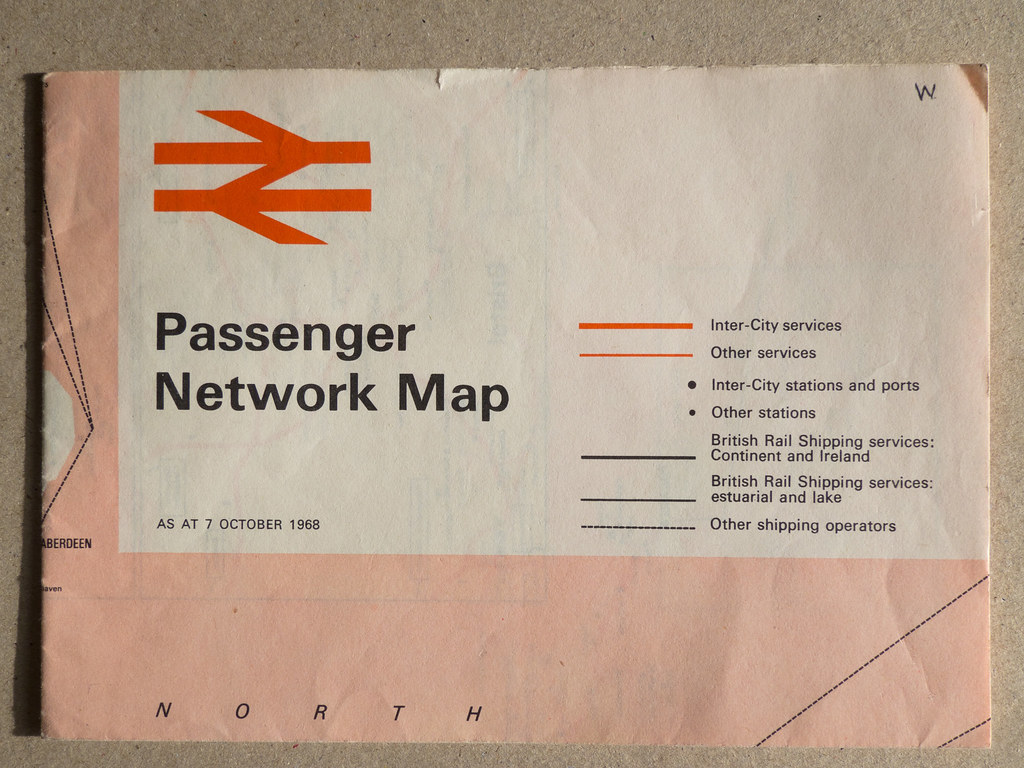
British Rail Passenger Network Map - 1968
This top example is most likely a 2 colour offset-litho process, using a halftone of the red
for the block areas, full red for the logo and track lines and black for the text. Process aside,
the typography, colour and strokes used throughout this map work on so many levels,
leaving me genuinely wanting to own a copy for my visual pleasure!
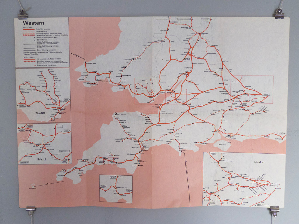
International Network Map - '79/80
Again unsre of the designer, but this time I believe it might have been a 3 colour process.
Using an extra blue to represent the surrounding water, the detail shot below examples
how crisp the print quality is and really gets my infographic head on.
There must have been a certain consideration towards the stock seing as it's to be constantly
folded in and out, wanting a heavy enough GSM to retain its stabilty but not so far it starts
to crack once folded.
I love the aged appearance of (once folded down) the front and back.
Teatowel
2010 Year Book for Bath School of Art and Design - Graphic Communication. Design by
Lauren Murray and Kirsty Lake. What a brilliant alternative to bringing everyone together
at the end of a year, just like what many mums still have in their draws from our youths.
A single colour process most likely silk screened and packaged simply and effectively along
side a small index booklet.
I'm mainly attracted to this project through the alternative use of stock, they really have
considered the essentials of what they wanted to communicate and executed it in a very
original manor.


24.9.11


Milk Cartons
DUCATS MILK designed by Heinz Grunwald in the 80's. Phenomanal use of colour given
that it is merely packaging for milk, although it would definitely not only stand up to todays
design standards but stand out amongst alot of functional package design for food and
drink.
Im unsure of the prinitng process but I would say that it went through a 4 colour process
given the variation of colour.
23.9.11
Howies Recycle
This promotional brief from Wallace Henning communicates how the Howies Sundown
jacket is made from fully recycled material and can slip right back into the cycle when
finished with.
When fully folded, the size is A6 format but once expanded the simple construction together
with the typography aims to have no distinct beggining or end. Beautifully vinyl cut lettering
reinforce the concept, the choice of grey stock works incredibly well keeping both the white
and black wording fully legible.


Subscribe to:
Posts (Atom)