19.11.12

Harmonograph

Charlotte bought this book in for Will as it examples some really interesting shapes and line formations. Will started showing it to me and it wasn't until I noticed the cymatic shapes we used last year that I realised it was completely relevant to the Cymatic project Matt and myself are continuing this year.

We have been struggling for content to fill the book. We wanted to take it a lot more towards a factual/reference response instead of a more experimental take we used last year. We still want to take it forward using our own responses using video and image, but we want to combine it with existing knowledge and theories about the relationship of sound and image.

The book is titled - 'HARMONOGRAPH - A visual guide to the mathematics of music' a perfect resource for us, it has a lot of the content we researched last year, but also a wealth of undiscovered ideas and facts that could be perfect for our book. We are thinking about stripping a lot of the content from the book and applying it to our own response in order to develop a decent amount of content that is relevant and not just a mish-mash of found content. It can offer us a set structure and condensed descriptions without having to spend an abundance of time re-writing and generating content.

(This PDF isn't great quality as the original was just under 200mb so a mighty reduction took place in order for issuu to contemplate uploading it)

18.11.12

Hot Chip

Just a quick post, I had to keep track of this recent Hot Chip artwork by Jeremy Deller, the 2004 Turner Prize winner. I love the rather mind boggling pattern that has elements of repeat pattern within it, but doesn't allow you to really follow how it works, until you recognize certain repetitive shapes, but even then still offers a really complex visual that keeps testing the eye.


16.11.12

License

Whilst discovering the Lexicon card game in my attic, these old driving licenses that once belonged to my grandad popped up. I love again how small they are, no bigger than a playing card but still fully functional little books. Simple type over block colour, each with a different crest, I'd like to find out why each crest is different seeing as they are all English and were issued not too far apart in terms of years.


It's a shame they are from the late 40's and 50's or they could've made a feature in the typography book I'm producing for the 80 YEARS ON brief. The contrast between printed and written type is really interesting in the bottom left scan, handwriting was so much more considered as it was still one of the main methods of documentation for the average person back then. The digital age has allowed us to become a lot sloppier when it comes to hand rendered type, rarely seeing examples like this magenta and blue, I couldn't even imagine having handwriting so perfect!


Lexicon 1934


15.11.12

Background

When scanning in a few of my notes for the 80 YEARS ON brief, I noticed my little 'Filed Notes' notebook had a little story as to why and when the brand came to produce these little note books. They were produced for the intention of agricultural notes, as the 'vanishing subgenre of agricultural memo books' continues to decrease. It also has a section named 'Practical Applications' with entries such as 'Crop predictions' - 'Dart vs. Balloon Strategic Analysis' (personal favourite) - 'Freehand Drawings' and 'Crow Scaring Plans'. It thought this was a really playful element to the book and instantly reminded me of the little background story I'm using within the swing tag for the COTT&FLYER brief. It's made me want to deliver an even more informal, playful element to my branding, A more personal touch.

13.11.12

90's

Another post courtesy of the flyer sources, all of the images here are from phatmedia.co.uk. Having spent a good hour or so thoroughly browsing through their catalog I started saving some of my more favorable to put together in a quick PDF. I could spend all evening browsing but they've really got me wanting to get back to designing some artwork after that mass of colour-heavy, playful design.


Inspired by quite a few of the flyers, I want to capture an element of these old skool designs by taking swatch pallets from some of the more colour schemes I've found. Keeping working with the 3D LOCO created using the perspective grids I want to see how far I can take it applying different techniques.

ARK

I found a resource website called roachmaterial, the site is dedicated to old school club and festival nights, mainly focusing on a written histroy of the ebolution. It does howevr link out to a few sites that offer massive libraries of the aforementioned flyer desins and artwork.

This is the first post of a few generated by this finding, purely because the database is so prolific!
Ark promotions were a company thriving in the Leeds and Yorkshire area in the 90's, putting on a lot of club/house nights. Their flyer designs are impeccable, a lot of which could stand the test of time today and blend in perfectly with the wheat-pasted posts we see around leeds.


I'm particularly drawn to the use of colour, shape and repeat pattern, very much like the visuals i'm trying to attain for the LOCO night we're working on at the moment. I'm intrigued to find out whether or not the designer(s) are still active and producing similar work?


8.11.12

Mozart

Wolfgang Amadeus Mozart - Ich würd auf meinem Pfad, KV 390

6.11.12

Typo(gateaux)''12

Thinking about Typogateaux 2012, Yaf and myself have been assigned the branding and promotion of this years event.
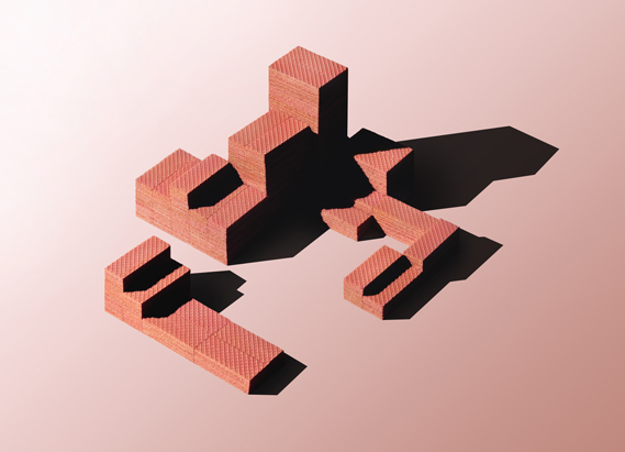
I found these very interesting architectural sculptures by Gary Bryan a few months back, made entirely from biscuits and clever photography skills. The pink wafer structure below really caught my eye and I had my heart set on the idea of entering a pink wafer sculpture in homage to this beautiful work. After a while I got more engrossed in the idea of the shadows cast by the structures and when I showed Yafet the ideas started to flow.


25.10.12

17.10.12

Changes

How did the Industrial Revolution change fashion?

During the industrial revolution, both men's and women's dress becomes more complex during this era due to the invention of the Sewing Machine, and the popular dissemination of pattern books and systems for garment cutting. Men's clothing, while outwardly simple, begins to acquire the internal padding, interfacings and complex structure that makes modern men's suits fall so smoothly even over an object as lumpy and mobile as the human form. Men's fashion becomes a series of undecorated black tubes, like the smoke stacks of The Industrial Revolution, while women's dress continues to balloon out with ruffles, decorations and petticoats.

Flyer&Bobbin

After devloping the first half of my brand name through the discovery of Mr Cott, I started looking at industrial equiment that was revolutionary in Britian regarding the textile industry. I want the brand to reminice on past acomplishments Britain has claim to within the fashion & textiles industry.

"Use of the spinning wheel and hand loom restricted the production capacity of the industry, but incremental advances increased productivity to the extent that manufactured cotton goods became the dominant British export by the early decades of the 19th century...

Lewis Paul patented the Roller Spinning machine and the flyer-and-bobbin system for drawing wool to a more even thickness, developed with the help of John Wyatt in Birmingham."

I love the sound of a flyer and bobbin machine, the name rolls off the tongue rather nicely...


"Ring spinning was slow due to the distance the thread had to pass around the ring, but certain methods have improved on this; such as flyer and bobbin and cap spinning."

So it seems the flyer and bobbin revolution allowed mass advancements in textile production, Britain found themselves at a much more superior position than any other country within the industry. In homage to this great piece of machinery, I want to use an element of the name in my response to the Fashion Brand of the Future brief.

I want the name to sound typically English, drawing on elements of our history but presenting the brand in a very modern and contemporary style. I feel this will work in terms of the brief reqirements and I'm happy to work with a name of this nature.

16.10.12

Revolution

Trying to develop a name for the FBOTF brief, is proving hard. I keep mixing and matching words related to the proposed principles of the brand but many are turning out sounding very foreign or too alike current fashion labels. A few of todays; ADET, TAILE, AFFRIL all of which are pretty appalling.

The screen shot below is a snap from wikipedia; the brief talks about capturing our achievements, particularly those throughout the industrial revolution, so I thought looking into the Textile manufacture history might help...


It was interesting reading about the machinery used such as; the spinning wheel, hand loom, Spinning machine and the flyer-and-bobbin. I really like the name flyer-and-bobbin, not necessarily for for a brand name, I think it just rolls of the tongue nicely.

I haven't really considered using a double barrel name, although I feel this could work, I just need to come up with relevant words without sounding overly cheesy. The problem I'm finding whilst researching is that many of the top brands in fashion are simply designers names, either shortened or parts of - the only relevant name to the design at the moment is my own, and I'm ruling that out as an option immediately.

Although, maybe the idea of a name isn't so bad. I might look into people that had a massive influence to the industrialisation of Britain, maybe even with regards to textile advancement. Again though, I have to remember it's a fashion brand of the future, and not reminisce on the past too much.