
Showing posts with label OUGD205. Show all posts
Showing posts with label OUGD205. Show all posts
29.3.12
22.3.12


19.3.12
Motion
Contiunuing visual research into shape/colour/type/sound for the image module, I came across these beautifully simple motion graphic pieces from mucho studio. Both are heavily focused around shape. I want to look at how type and shape relate and what can occur when motion is introduced. The first video here could be seen as working with the letter 'o', but i'm sure they're just circles, regardless of this, video could be a very feasible outcome for my self directed brief commencing over the next few weeks.
4.3.12
29.2.12
26.2.12
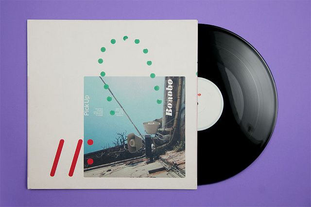
spectrum
A circular musical spectrum analysis generated by Jon-Kyle Mohr
who tells; "A musical tone consists of multiple overlapping sine-waves
oscillating at varying rates. This motion graphic represents the
isolated frequencies and rhythmic patterns of Ryan York's “If I Am This
Forest”. Of particular interest is the swell beginning at 0:45, and
multiple simultaneous frequencies which form the single melodic vocal
line at 2:05.


24.2.12


23.2.12
Donuts
This series of prints from graphic designer Michael Cina
marks the latest release in an ongoing exploration of the connection
between music and visual art, and has us thinking “sprinkle donut minus
the donut.” Still, “This is what I feel and see when listening to
music,” the artist persists, so we put on some music and look deeper.
Dude might have a point, as a good song can feel like a complete circle
with its very own depth, dimension and attraction—or, in other words,
like a donut.


M i l k ! ?
Amazing experiments, surprisingly often found being tought to primary school childeren, which is quite frustrating as nobody ever informed me about this when I was at school! Moving on, I love the constantly evolving shapes and merging colours that emerge from simply combining milk, food colourant and washing up liquid. In terms of colour and shape it is more than relevant to both, although in terms of sound it bears nothing. This said it, it could be encorporated to our studies quite simply.
I had the idea to work with diluted inks on fairly deep dish plates, influenced by sound resinating underneath and recorded on camera. To apply this milk concuction to this would be straight forward and could again create some fantastic results - definitely something to explore further.
I had the idea to work with diluted inks on fairly deep dish plates, influenced by sound resinating underneath and recorded on camera. To apply this milk concuction to this would be straight forward and could again create some fantastic results - definitely something to explore further.
Cymatics
Looking to create our own video response exploring this concept, this video is a really nice example of how sound can be visualized. I love the square format of the video, we were maybe thinking of having a square format for the pack we're going to create as our final response - this square format could feed right through to the videos, poster and booklets we produce?
After recently experimenting with rice and sugar on our own speaker, it is most likely we are going to include a CD/DVD with various little projects of our own in a small pack.
After recently experimenting with rice and sugar on our own speaker, it is most likely we are going to include a CD/DVD with various little projects of our own in a small pack.
21.2.12
∏
Unfortunately I came across this image without any reference towards designer/studio, but I love the exploration of colour and texture over the same format. I'm unsure as to whether these pieces are zines/posters/boklets or even envelopes? Regardless of the context, it undoubtely produces some really high impact imagery, combining a rather ecclectic colour pallet that works incredibly well.
For this current book brief, Matt and myself are looking to produce a small book/zine, posters and an audio-visual CD wrapped up in a considered pack. We want to combine a variety of coloured and textured stocks to sit in harmony, much like these pieces fluant here.

For this current book brief, Matt and myself are looking to produce a small book/zine, posters and an audio-visual CD wrapped up in a considered pack. We want to combine a variety of coloured and textured stocks to sit in harmony, much like these pieces fluant here.

Kyle Poff
Typographic experiments from Kyle Poff. Massively focused on colour, Poff has worked on the manipulation of type to the point where it almost becomes an exploration into shape, contrasting beautifully against the backgrounds. Less interested in focusing on type for this brief, it is always beneficial to keep exploring different responses to type as image, these being two of my most recently favoured pieces. I'd like to understand the context for the quotes, but nonetheless he's produced some cracking design in my opinion.


wang zhi hong
Taiwan-based Wang Zhi Hong has perfected a minimal (sort of),
type-centric, and beautiful style of book design. He's won Taiwan's
highest honor for book design five times as well as various other
international recognitions and awards.
A selection of some of my most favoured book designs from Wang, the 'how to start your own country' pack immidiately below is almost exactly the kind of format we've been visulizing for our current project exloring sound as shape. The colour and stock choices here are impeccable, in keeping with a lot of his practice Wang is very minimal, using colour as and where appropriate and I think this works so well.


A selection of some of my most favoured book designs from Wang, the 'how to start your own country' pack immidiately below is almost exactly the kind of format we've been visulizing for our current project exloring sound as shape. The colour and stock choices here are impeccable, in keeping with a lot of his practice Wang is very minimal, using colour as and where appropriate and I think this works so well.


Team
Eploring 'what is a book', the 'TEAM - Process is Form' publication is an example of how the content and readibility of a book can be mixed up to achieve a high impact on the reader.
Picking up the book, it soon becomes obvious that the usual name and author along the spine has been abolished and replaced with the referancing for the content of the book.
The initial pages go straight into the documentation (pure imagery) of print processes/equipment and exploration into colour and shape. It's not untill halfway through the book that one comes across written content, and effectively what could be seen as the title pages, usually found at the front. I love the element of mystery that this adds whilst browsing the inital pages, unsure of what and why these choices have been made.
Definitely a concept to be explored for our own publication, although I highly doubt our book will be worthy of a spine, and will most probably use some kind of simple stitched binding method.
20.2.12
x shape
GIF's have become a massive interest of mine recently, exploring their use for previous image briefs, I'd love to start producing some abstract shape experiments like these in my own time, or even better if I can encorporate them into my design practice contributing towards module projects.
Working towards the book brief this research isn't entirely relvant, although it is very much focused on the concept of shape and geometry, a massive interest of mine that will continue to grow.


Working towards the book brief this research isn't entirely relvant, although it is very much focused on the concept of shape and geometry, a massive interest of mine that will continue to grow.
Subscribe to:
Posts (Atom)