19.11.12

Harmonograph

Charlotte bought this book in for Will as it examples some really interesting shapes and line formations. Will started showing it to me and it wasn't until I noticed the cymatic shapes we used last year that I realised it was completely relevant to the Cymatic project Matt and myself are continuing this year.

We have been struggling for content to fill the book. We wanted to take it a lot more towards a factual/reference response instead of a more experimental take we used last year. We still want to take it forward using our own responses using video and image, but we want to combine it with existing knowledge and theories about the relationship of sound and image.

The book is titled - 'HARMONOGRAPH - A visual guide to the mathematics of music' a perfect resource for us, it has a lot of the content we researched last year, but also a wealth of undiscovered ideas and facts that could be perfect for our book. We are thinking about stripping a lot of the content from the book and applying it to our own response in order to develop a decent amount of content that is relevant and not just a mish-mash of found content. It can offer us a set structure and condensed descriptions without having to spend an abundance of time re-writing and generating content.

(This PDF isn't great quality as the original was just under 200mb so a mighty reduction took place in order for issuu to contemplate uploading it)

18.11.12

Hot Chip

Just a quick post, I had to keep track of this recent Hot Chip artwork by Jeremy Deller, the 2004 Turner Prize winner. I love the rather mind boggling pattern that has elements of repeat pattern within it, but doesn't allow you to really follow how it works, until you recognize certain repetitive shapes, but even then still offers a really complex visual that keeps testing the eye.


16.11.12

License

Whilst discovering the Lexicon card game in my attic, these old driving licenses that once belonged to my grandad popped up. I love again how small they are, no bigger than a playing card but still fully functional little books. Simple type over block colour, each with a different crest, I'd like to find out why each crest is different seeing as they are all English and were issued not too far apart in terms of years.


It's a shame they are from the late 40's and 50's or they could've made a feature in the typography book I'm producing for the 80 YEARS ON brief. The contrast between printed and written type is really interesting in the bottom left scan, handwriting was so much more considered as it was still one of the main methods of documentation for the average person back then. The digital age has allowed us to become a lot sloppier when it comes to hand rendered type, rarely seeing examples like this magenta and blue, I couldn't even imagine having handwriting so perfect!


Lexicon 1934


15.11.12

Background

When scanning in a few of my notes for the 80 YEARS ON brief, I noticed my little 'Filed Notes' notebook had a little story as to why and when the brand came to produce these little note books. They were produced for the intention of agricultural notes, as the 'vanishing subgenre of agricultural memo books' continues to decrease. It also has a section named 'Practical Applications' with entries such as 'Crop predictions' - 'Dart vs. Balloon Strategic Analysis' (personal favourite) - 'Freehand Drawings' and 'Crow Scaring Plans'. It thought this was a really playful element to the book and instantly reminded me of the little background story I'm using within the swing tag for the COTT&FLYER brief. It's made me want to deliver an even more informal, playful element to my branding, A more personal touch.

13.11.12

90's

Another post courtesy of the flyer sources, all of the images here are from phatmedia.co.uk. Having spent a good hour or so thoroughly browsing through their catalog I started saving some of my more favorable to put together in a quick PDF. I could spend all evening browsing but they've really got me wanting to get back to designing some artwork after that mass of colour-heavy, playful design.


Inspired by quite a few of the flyers, I want to capture an element of these old skool designs by taking swatch pallets from some of the more colour schemes I've found. Keeping working with the 3D LOCO created using the perspective grids I want to see how far I can take it applying different techniques.

ARK

I found a resource website called roachmaterial, the site is dedicated to old school club and festival nights, mainly focusing on a written histroy of the ebolution. It does howevr link out to a few sites that offer massive libraries of the aforementioned flyer desins and artwork.

This is the first post of a few generated by this finding, purely because the database is so prolific!
Ark promotions were a company thriving in the Leeds and Yorkshire area in the 90's, putting on a lot of club/house nights. Their flyer designs are impeccable, a lot of which could stand the test of time today and blend in perfectly with the wheat-pasted posts we see around leeds.


I'm particularly drawn to the use of colour, shape and repeat pattern, very much like the visuals i'm trying to attain for the LOCO night we're working on at the moment. I'm intrigued to find out whether or not the designer(s) are still active and producing similar work?


8.11.12

Mozart

Wolfgang Amadeus Mozart - Ich würd auf meinem Pfad, KV 390

6.11.12

Typo(gateaux)''12

Thinking about Typogateaux 2012, Yaf and myself have been assigned the branding and promotion of this years event.
I found these very interesting architectural sculptures by Gary Bryan a few months back, made entirely from biscuits and clever photography skills. The pink wafer structure below really caught my eye and I had my heart set on the idea of entering a pink wafer sculpture in homage to this beautiful work. After a while I got more engrossed in the idea of the shadows cast by the structures and when I showed Yafet the ideas started to flow.


25.10.12

17.10.12

Changes

How did the Industrial Revolution change fashion?

During the industrial revolution, both men's and women's dress becomes more complex during this era due to the invention of the Sewing Machine, and the popular dissemination of pattern books and systems for garment cutting. Men's clothing, while outwardly simple, begins to acquire the internal padding, interfacings and complex structure that makes modern men's suits fall so smoothly even over an object as lumpy and mobile as the human form. Men's fashion becomes a series of undecorated black tubes, like the smoke stacks of The Industrial Revolution, while women's dress continues to balloon out with ruffles, decorations and petticoats.

Flyer&Bobbin

After devloping the first half of my brand name through the discovery of Mr Cott, I started looking at industrial equiment that was revolutionary in Britian regarding the textile industry. I want the brand to reminice on past acomplishments Britain has claim to within the fashion & textiles industry.

"Use of the spinning wheel and hand loom restricted the production capacity of the industry, but incremental advances increased productivity to the extent that manufactured cotton goods became the dominant British export by the early decades of the 19th century...

Lewis Paul patented the Roller Spinning machine and the flyer-and-bobbin system for drawing wool to a more even thickness, developed with the help of John Wyatt in Birmingham."

I love the sound of a flyer and bobbin machine, the name rolls off the tongue rather nicely...


"Ring spinning was slow due to the distance the thread had to pass around the ring, but certain methods have improved on this; such as flyer and bobbin and cap spinning."

So it seems the flyer and bobbin revolution allowed mass advancements in textile production, Britain found themselves at a much more superior position than any other country within the industry. In homage to this great piece of machinery, I want to use an element of the name in my response to the Fashion Brand of the Future brief.

I want the name to sound typically English, drawing on elements of our history but presenting the brand in a very modern and contemporary style. I feel this will work in terms of the brief reqirements and I'm happy to work with a name of this nature.

16.10.12

Revolution

Trying to develop a name for the FBOTF brief, is proving hard. I keep mixing and matching words related to the proposed principles of the brand but many are turning out sounding very foreign or too alike current fashion labels. A few of todays; ADET, TAILE, AFFRIL all of which are pretty appalling.

The screen shot below is a snap from wikipedia; the brief talks about capturing our achievements, particularly those throughout the industrial revolution, so I thought looking into the Textile manufacture history might help...


It was interesting reading about the machinery used such as; the spinning wheel, hand loom, Spinning machine and the flyer-and-bobbin. I really like the name flyer-and-bobbin, not necessarily for for a brand name, I think it just rolls of the tongue nicely.

I haven't really considered using a double barrel name, although I feel this could work, I just need to come up with relevant words without sounding overly cheesy. The problem I'm finding whilst researching is that many of the top brands in fashion are simply designers names, either shortened or parts of - the only relevant name to the design at the moment is my own, and I'm ruling that out as an option immediately.

Although, maybe the idea of a name isn't so bad. I might look into people that had a massive influence to the industrialisation of Britain, maybe even with regards to textile advancement. Again though, I have to remember it's a fashion brand of the future, and not reminisce on the past too much.

15.10.12

House logo's


British Fashion

Continuing to look at the online presence of British fashion brands, the three below are very well known and renowned brands within the UK, not only for men but also female wear as well.
There is still a running theme that I've noticed running throughout all of the major brands I've looked at so far. Simplicity. A very simple, clean cut style has been applied to all of the homepages and the content stays true to this style throughout browsing. A distinct lack of colour is apparent too, with two of these three opting for a predominantly black and white appearance. It's strange because I see fashion being as much about colour and texture as it is about style and finish, but I suppose it's more predominantly about class and finesse for the more exquisite brands and the black and white does deliver this quite effectively.


Apart from the Barbour logo, Alfred Dunhill and Burberry again flaunt a serif typeface for their logos and most of the body text. Repeatedly used throughout the research I've carried out so far, I want to try and steer away from this classic style of type, after all the brief is called 'Fashion Brand of the Future'.

I do have to bare in mind the fact that the brief asks for the brand to capture the qualities of Great Britishness, reflecting on the industrial revolution and other great achievements in the UK over the years.

I'm thinking about looking into a more industrial based body of research, feeding this into my design process and seeing how Britain really affected design and fashion from very early on.

Subconscious

Over the weekend, Oli and myself sat and watched a couple of episodes of 'Through the Worm Hole', a scientific documentary series hosted by Morgan Freeman. The episode that led me to write this was called 'Mysteries Of The Subconscious', it looks into our subconscious thought and how it allows us to make decisions and act in in ways that we wouldn't consciously choose.

It was the analysing of brain patterns and scientific results that got us thinking about how it could relate to the 'LOCO' brief we're both working on. Loco translates back to 'madness' and 'crazy', a state of mind that can often relate to club nights, particularly with deep electronic music.

Below are a few screen shots of the imagery used to analyse brain patterns when dealing with the conscious and subconscious. It immediately got me thinking about artwork for the club night as I'd already had an idea about dripping coloured squares representing the pattern and beats of the music, exampled in a design sheet on an earlier post.


It is definitely an idea that will stay in the main stream of our design practice, not necessarily keeping the same colour scheme or pattern formation, but the concept will relate back to the alteration of our state of mind (and how that can be recorded) when in club situations such as the one we're designing for.

12.10.12

Publications

Looking at existing publications, more particularly their production, binding and physical attributes. I want to experiment with more unusual techniques when producing my '80 Years on' publication, exploring typographic history in the 20's & 30's and how that has informed the use of type today.

I swear I use no art at all

is the 101st published book by Joost Grootens. The concept is beautiful, it is simply a documentation of his past 100 books. A great selection of the grids, binds, images and content from his past projects are all included.

 The first press was a run of 1000 limited editions, Grootens then tracked down as many of the 1000 books all over the world and produced an info graphic poster as to each of their where abouts, included in each of the books there after. Beautiful.


One thing I love about this book is the tiered sections throughout, essentially I think they are a progression of tip-ins all the way through, but it is a really functional way to divide content, especially in a book that is so focused on information and a record of past projects.


It was hard to miss this Exhibition booklet laying around college, but I thought I'd give it a little mention as it does use a fancy print finish and rather unconventional half cover, it's little experiments like this that I want to start incorporating into my publication, particularly as I want it to be more of a playful brief.


This next example is a hand made publication, I picked it up for £10 pound at the last Leeds book fair. It is a personalised graphic representation of a song by The Caseroom Press, it was quite a coincidence as we were sat next to them at the fair and our response was music related and we got talking about different projects and methods to visualising audio.

I love the simplicity of the content, no text, just visual compositions of a song completely determined by personal take on what it meant to them. The front cover is a large folding poster that can be accessed by taking the bind apart. I'm yet to make use of the poster as I can't bring myself to dismantle this lovely publication.


10.10.12

9.10.12

Ghurka

Ghurka are an American company supplying leather bags commonly used for hand luggage and general use. It's not particularly in my area of proposed research, although I couldn't help blogging it due to the use of a crest like logo. I couldn't ascertain how long they've been established for, but again they have an 'our heritage' link that suggests they may have been in the game for a while.

It seems as though these luxury brands like to make the fact that they have "heritage" very apparent, maybe in order to gain the buyers trust or just to seem as though they know what they're talking about, either way they have some really nice stuff, and they seem to be able to back up their crest style logo with some kind of reasoning as to its existence.


8.10.12

Luxury Labels

Looking at existing luxury menswear brands to get a feel for the kind of aestetic that is commonly found within the market. Although the brief explicity states an English style/feel is necessary, I want to also look at how european and overseas brands deliver themselves in order to attract the required audiences.

The word 'Luxury' can have many connotations, mainly expressing a level of quality and expense, but it can also depict a way of life, which is what the 35-50 year old male wants to aspire to. Clean-cut, crisp and elegant are all words found whilst looking at synonyms of the keywords provided on the brief and all can be seen in effect on most of the website/stores I've been looking at, exampled below...


SUNSPEL - UK


SUNSPEL - Established in 1980, pride themselves on their heritage and craftsmanship, and as soon as one enters their online presence it immediately rings Clean-Cut, Fresh and Quality, but above all it really does have an English feel to it. The Crest logo and the illustrated 'traditionally english' male character reinforce the English heritage.

Thinking 'English' could possibly cunduer up more traditional thoughts of red, white and blue - not at all to say that it is over used in any way amongst the English fashion industry, but colour can have a big influence on the tone of voice and overall image of a brand. Black and white with hits of natural colour work so well here, allowing focus on product and quality.


CROMBIE - UK


CROMBIE - are another UK born brand that are even more proud on the heritage side of things, something that seems to be a common occurance within luxury British brands. Established in 1805 they have a long history of making quality clothing, which resounds throughout the website. Another thing I've noticed is the use of serif typefaces within the logos of both brands above, and even more so the use of a crest.

The British are quite renound for our use of crests, with important, wealthy familes having their own crests for hundreds of years as a symbol of the aforementioned. Naturally this has stemmed into our businesses and brands in an attempt to keep the British affiliation.

I like the idea of crest logos, although the brief name itself almost contradicts the use of them; 'The Fashion Brand of the Future', sugesting that it should be resolved in a freshly thought out manor. I shalln't rule them out just yet but I won't be rushing to immitate this style with good reasoning.
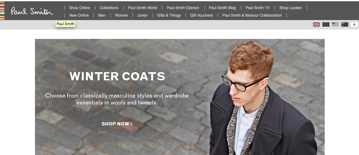


PAUL SMITH - UK


PAUL SMITH - is another UK founded brand, grown from a little boutique in Nottingham over 40 years ago. Paul smith is now considerd the pre-eminent British designer, with over 14 stores here and 66 worldwide. Considered the epitome of British Fashion, it's reassuring to see more inviting and playful branding. I've always been a fan of Paul Smiths' identity with the multi-coloured stripes applied to swingtags, perfumes, packaging and so on. It is immidiately identifyable and very reassuring after looking into the two previous brands that have very little in the way of evocative and colourful identities.


Past and Preent

I feel some of my research from the tail-end of last year could start to feed in to this particular brief, although the audience is very much more specific and the tone of voice is considerabley more formal, some of the posts could have great influence on the way I go around formulating and designing a luxury menswear label.

The 'Steady Guy' re-brand was greaty targetted towards a younger, still male, fashion orientated audience. A lot of the context I was looking at introduced some fresh and exciting concepts that may not usually be associated with 'Luxury Menswar'. I do however believe that incorporating the two could have some interesting results.


The key thing that keeps playing on my mind is the fact that the male audience I'm designing for have no particular interest in fashion so to speak, other than they want to look professional and clean-cut.

It is this idea of designing for an audience that may or may not have a thought-process regarding the concepts behind a brand or label that I want to penetrate, appealing to those who do whilst interesting and inviting those who don't.


Defined

LUXURY


Overview of noun luxury

The noun luxury has 3 senses (first 2 from tagged texts)
                                         
1. (5) luxury, extravagance -- (something that is an indulgence rather than a necessity)
2. (1) lavishness, luxury, sumptuosity, sumptuousness -- (the quality possessed by something that is excessively expensive)
3. luxury, luxuriousness, opulence, sumptuousness -- (wealth as evidenced by sumptuous living)

Overview of adj luxury

The adj luxury has 1 sense (first 1 from tagged texts)
                                           
1. (2) deluxe, de luxe, luxe, luxury -- (elegant and sumptuous; "a deluxe car"; "luxe accommodations"; "a luxury condominium")


Affluence, Bliss, Comfort, Delight, Enjoyment, Exorbitance, Extravagance, Frill, Gratification, Hedonism, High living, Immoderation, Intemperance, Leisure.


TAILORED


Overview of verb tailor

The verb tailor has 3 senses (first 2 from tagged texts)
                                         
1. (5) shoehorn, tailor -- (make fit for a specific purpose)
2. (1) cut, style, tailor -- (style and tailor in a certain fashion; "cut a dress"; "style a wedding dress")
3. sew, tailor, tailor-make -- (create (clothes) with cloth; "Can the seamstress sew me a suit by next week?")

Overview of adj tailored

The adj tailored has 2 senses (first 1 from tagged texts)
                                        
1. (3) tailored, trim -- (severely simple in line or design; "a neat tailored suit"; "tailored curtains")
2. bespoke, bespoken, custom, made-to-order, tailored, tailor-made -- (of clothing)
 
Accommodate, Adapt, Alter, Conform, Convert, Custom-make, Cut, Cut to Fit, Dovetail, Fashion, Fit, Make to Order, Modify, Mold, Quadrate, Reconcile, Shape, Shape Up, Square, Style, Suit.


FRESH


Overview of adj fresh

The adj fresh has 13 senses (first 5 from tagged texts)
                                          
1. (16) fresh -- (not stale or old; "fresh bread"; "a fresh scent")
2. (7) fresh -- ((of a cycle) beginning or occurring again; "a fresh start"; "fresh ideas")
3. (4) bracing, brisk, energizing, energising, fresh, refreshing, refreshful, tonic 
4. (3) fresh, new, novel -
5. (2) fresh -- (not canned or otherwise preserved; "fresh vegetables")
6. fresh -- (not containing or composed of salt water; "fresh water")
7. fresh -- (having recently calved and therefore able to give milk; "the cow is fresh")
8. fresh, invigorated, refreshed, reinvigorated -- (with restored energy)
9. fresh, sweet -- (not soured or preserved; "sweet milk")
10. clean, fresh -- (free from impurities; "clean water"; "fresh air")
11. fresh -- (not artificial; "fresh cut flowers")
12. fresh, unused -- (not yet used or soiled; "a fresh shirt"; "a fresh sheet of paper"; "an unused envelope")
13. fresh, impertinent, impudent, overbold, smart, saucy, sassy --
Overview of adv fresh 
 
Beginning, Brand-new, Contemporary, Crisp, Current, Different, Gleaming, Glistening, Latest, Mint, Modern, Modernistic, Newborn, Now, Original, Radical, Raw, Recent, Sparkling, State-of-the-art.


DESIGN

Architecture, Arrangement, Blueprint, Chart, Comp, Composition, Conception, Constitution, Construction, Delineation, Depiction, Diagram, Doodle, Drawing, Dummy, Form, Formation, Idea, Layout, Makeup, Map, Method, Model, Outline, Paste-up, Pattern, Perspective, Picture, Plan, Scheme, Study, Tracery, Tracing, Treatment 


CLEAN

Blank, Bright, Cleansed, Clear, Delicate, Elegant, Faultless, Flawless, Fresh, Graceful, Hygienic, Immaculate, Neat, Orderly, Pure, Simple, Spic and Span, Spotless, Squeaky, Stainless, Taintless, Tidy, Trim, Unblemished, Unspotted, Unstained, Vanilla, Washed, Well-kept, White

Keywords

The 'Fashion Brand of the Future' brief asks for certain elements to be considered whilst designing, conceptually and physically...

"The concept must the unisex since we plan to start as a Menswear label but then expand into men's accessories, toiletries, leather goods and eventually women's wear.

Our customer base will initially be a professional male, approximately between the ages of 35-50. They will have a well paid job working office hours. He likes to be up to date on the latest gadgets, news and accessories but isn't concerned about fashion. His interests are in sport and outdoor activities. his needs for clothes are a good fit and quality items that look age appropriate. He wants something that can be used for work, social occasions since he will have personal responsibilities such as a family and a career."

KEY WORDS   

Luxury • Menswear • British • Engineering • Tailored • Fresh • Clean • Design   

I'm going to look into and expand on these words as a starting point to branch out from, I've found searching for synonyms and visualising certain keywords associated with a brief that it can trigger ideas at quite a fast pace, particulalry the nouns and adjectives.


5.10.12

Regimental

I want to introduce a more regimental structure to my tagging process this year. It's quite an obvious point to make however I don't want a mash of brief titles clogging up my posts and label selection and also to make it easier to identify my core briefs for the module. On top of the usual OUGD301, I am going to tag each brief as 301.1, 301.2 and so on, each representing the corresponding briefs.

I'm using this post as a point of reference to state which briefs correspond with the tag code;

301.1_Fashion brand of the future

301.2_80 Years on

301.3_Cymatics (collaboration with Matt Tucker)

301.4_Loco (collaboration with Oli Cassell)

16.5.12

Swingtags


Lookbooks

I collected these look books from some of the more high end shops in Leeds city centre, just to get an idea of stock, format and layout throughout. They're all very minimal, an absolute minimum regarding text allowing room for maximm image.


I want to explore the lookbook concept to promote Steady Guy, a current up to date look book could be sent out with orders over a certain amount, or requested and sent out on demand. My only problem with this is having professional imagery of models wearing clothes Steady Guy stock, I may have to just steal a few images from here and there in order to make up the imagery - printing and binding it in such a way that makes it individual to Steady Guy.

11.5.12

B

A friend recently posted this randomly from her travels around the USA, turns out you can buy it in Tesco anyway but regardless of this it grabbed my eye and I immidiately saved it to my desktop (bad practice I know). I can't get enough of this script style type at the moment, this B is gorgeous. It's probably due to the fact I've been working on my 'steady guy' logo which is of a similar nature.


Working Class


Working Class Heroes is a pretty standard online clothing store, but whilst browsing I did notice the section pictured below, each brand is pictured with small play button, a little touch I haven't seen. I was slightly bemused by why a play button would be used, is there some kind of animation linked to it? there isn't, just links to the brand section, but it got me to click it nonetheless.


Vivism

Vivism feels very high class as soon as one opens the homepage. It works more like a PDF file opposed to a conventional website, something that is immidiately engaging, and to be honest, pretty confusing to navigate.

A Japanease collective, Vivism make themselves availiable worldwide but only though exclusive outlets.


After a bit of research, it seems exclusivity is the key to sucess within the higher-end clothing brands, the harder it is to get, the more passionate enthusisats are going to want to get their hands on it, it's a rather shallow and egotistical industry, I know.

Their web presence is unlike anything I've found so far, with clearer navigation and maybe less content, it could work really well as a portfolio site.

8.5.12

StreetHearts

Visual identity for street fashion blog by Heydays here, I love so much of their work, I'd love to take a trip that way and drop by. The Streethearts is an Oslo-based blog, with an international focus. The blog is run by two talented photographers, Andreas and Eirik, and is already getting noticed worldwide. We have created a logotype, business cards, notepad, and web layout. The result is inspired by street aesthetics, but mixed with a pure, no-fuzz style -- giving room for the large detailed photos.


shop the streets

Yet another Barnickel Design project, some really considered stuff going on over at their website. Shop the streets is an initiative to set up an e-commerce site that offers small boutiques and independant clothing stores the opportunity to sell online with a chance of undercutting what other, more established e-commerce sites have to offer.

The project was initially set up in NYC to help the downtown stores out, and came into light after assesing the rocketing US Retail E-Commerce sales.

Reading the project bio on Behance, there is talk about the identity and how 'The brand image had to be striking, bold and confident, but also had to be instantly recognizable and impactful at twenty pixels high on a website or twenty feet high on a billboard.' - Which has definitely been captured well, the logo works with the black shapes behind, and standing alone, and vice versa.