16.5.12


Lookbooks
I collected these look books from some of the more high end shops in Leeds city centre, just to get an idea of stock, format and layout throughout. They're all very minimal, an absolute minimum regarding text allowing room for maximm image.
I want to explore the lookbook concept to promote Steady Guy, a current up to date look book could be sent out with orders over a certain amount, or requested and sent out on demand. My only problem with this is having professional imagery of models wearing clothes Steady Guy stock, I may have to just steal a few images from here and there in order to make up the imagery - printing and binding it in such a way that makes it individual to Steady Guy.
I want to explore the lookbook concept to promote Steady Guy, a current up to date look book could be sent out with orders over a certain amount, or requested and sent out on demand. My only problem with this is having professional imagery of models wearing clothes Steady Guy stock, I may have to just steal a few images from here and there in order to make up the imagery - printing and binding it in such a way that makes it individual to Steady Guy.
11.5.12
B
A friend recently posted this randomly from her travels around the USA, turns out you can buy it in Tesco anyway but regardless of this it grabbed my eye and I immidiately saved it to my desktop (bad practice I know). I can't get enough of this script style type at the moment, this B is gorgeous. It's probably due to the fact I've been working on my 'steady guy' logo which is of a similar nature.


Working Class

Working Class Heroes is a pretty standard online clothing store, but whilst browsing I did notice the section pictured below, each brand is pictured with small play button, a little touch I haven't seen. I was slightly bemused by why a play button would be used, is there some kind of animation linked to it? there isn't, just links to the brand section, but it got me to click it nonetheless.

Vivism

A Japanease collective, Vivism make themselves availiable worldwide but only though exclusive outlets.

After a bit of research, it seems exclusivity is the key to sucess within the higher-end clothing brands, the harder it is to get, the more passionate enthusisats are going to want to get their hands on it, it's a rather shallow and egotistical industry, I know.
Their web presence is unlike anything I've found so far, with clearer navigation and maybe less content, it could work really well as a portfolio site.
8.5.12
StreetHearts
Visual identity for
street fashion blog by Heydays here, I love so much of their work, I'd love to take a trip that way and drop by. The Streethearts is an Oslo-based blog, with an
international focus. The blog is run by two talented photographers,
Andreas and Eirik, and is already getting noticed worldwide. We have
created a logotype, business cards, notepad, and web layout. The result
is inspired by street aesthetics, but mixed with a pure, no-fuzz style
-- giving room for the large detailed photos.


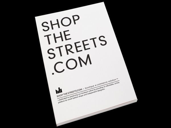
shop the streets
Yet another Barnickel Design project, some really considered stuff going on over at their website. Shop the streets is an initiative to set up an e-commerce site that offers small boutiques and independant clothing stores the opportunity to sell online with a chance of undercutting what other, more established e-commerce sites have to offer.
The project was initially set up in NYC to help the downtown stores out, and came into light after assesing the rocketing US Retail E-Commerce sales.
Reading the project bio on Behance, there is talk about the identity and how 'The brand image had to be striking, bold and confident, but also had to be instantly recognizable and impactful at twenty pixels high on a website or twenty feet high on a billboard.' - Which has definitely been captured well, the logo works with the black shapes behind, and standing alone, and vice versa.


Seco
Not a massive fan of greyscale on the whole, but I think the branding regardless of the printed collateral pictured below is really strong. Ricardo Seco is a Mexican fashion designer, the logo is very streamline and sleak, with that essence running through the whole of his identity, from envelopes to business cards.
I want to end up with a few crisp shots of printed matter like this by the time I've finished re-working the Steady Guy brand, on top of proposing imporived web presence and maybe some kind of printed/online zine.

I want to end up with a few crisp shots of printed matter like this by the time I've finished re-working the Steady Guy brand, on top of proposing imporived web presence and maybe some kind of printed/online zine.


studioNOW
StudioNOW is a young and international creative production company based in Berlin. This post bears relevance to both my current research into product, range & distribution and also touches on the self promotion tasks in PPD.
I love getting packs of things, looking through, unfolding and opening more things inside that, I have done since I was a kid, and receiving something like this will still get me excited for a long time im sure. I think it's a very playful way to send out what you have to offer, getting potential clients interested by forcing them to engage with the content but offering a number of ways to go about it.
I think there is a lot to be said about the target demographic here though too. Sending this kind of document to a corporate investor or an NHS advisor would be a waste of their time and effort, trauling through it to attain the right information, but as they are a creative production agency, people go to them in search of finding something a bit querky and playful - this screams exactly that in my opinion.


 With regards to how it relates to my current research, I've been thinking about lookbooks, more common for brands, it could be an aspect to consider for Steady Guy - maybe a quarterly zine of current stock and trends, even an online version if funds are tight.
I love getting packs of things, looking through, unfolding and opening more things inside that, I have done since I was a kid, and receiving something like this will still get me excited for a long time im sure. I think it's a very playful way to send out what you have to offer, getting potential clients interested by forcing them to engage with the content but offering a number of ways to go about it.
I think there is a lot to be said about the target demographic here though too. Sending this kind of document to a corporate investor or an NHS advisor would be a waste of their time and effort, trauling through it to attain the right information, but as they are a creative production agency, people go to them in search of finding something a bit querky and playful - this screams exactly that in my opinion.


UpThere
UpThereStore are similar to Black Sheep Road in many ways, although based in Melbourne and maybe slightly bigger, they both offer high quality fashion and both have a very strong navigatable online presence.
I wanted to particularly mention these guys as I really like how each product is photographed for customers browsing the website. The battered, varnished floorboard backdrop makes for something a little bit more visual to engage the user whilst browsing, opposed to everything sat on pure white - a backdrop that looses all purpose once the item is purchased.

I wanted to particularly mention these guys as I really like how each product is photographed for customers browsing the website. The battered, varnished floorboard backdrop makes for something a little bit more visual to engage the user whilst browsing, opposed to everything sat on pure white - a backdrop that looses all purpose once the item is purchased.

B S R
Black Sheep Road is a fantastic little boutique about 10 minutes from Amsterdam central station. I ran past it a couple of years ago in a rush to catch a flight, determinded to go back I visited last summer with my girlfriend and was so glad to have remembered. The shop itself was minimal to say the least, a couple of rails for the men and one for the women, but it was the branding that stuck with me. When looking for it all I could remember was 'sheep, I knew it was something to do with sheep', and it didn't take long.
I wish I had kept the receipts and other printed collateral, it all felt very bespoke with hand stamped logo and contact details. I think particularly for clothing stores and boutiques, stamp and ink is a really personal touch to receipts and compliment slips, definitely something I could consider for Steady Guy


I wish I had kept the receipts and other printed collateral, it all felt very bespoke with hand stamped logo and contact details. I think particularly for clothing stores and boutiques, stamp and ink is a really personal touch to receipts and compliment slips, definitely something I could consider for Steady Guy


Natural Super...
are a clothing label offering unique and original collections, from designers who pay homage to the global village streetwear fashion and culture. I like the way Natural Super have their online presence set-up, the homepage is a continuous scrolling blog, with the solid logo - fixed position in the middle of the page. It shows the very visual nature of the brand, they want to get you on board with the stuff they like, it's almost a personal welcoming into the hypothetical shop front, 'can I show you around sir?' - kind of thing.
I will definitely have to be considering the online presence of Steady Guy as at the moment it holds very little in the way of finese or browsing pleasure, As they have a blog feed and also a section selling artwork, I need to consider what would work for them without drawing the main focus away from clothing.

Being a label, Natural super only have their own clothes to worry about showcasing and therfore can be alot more specific in how they do so, and also with how they portray themselves on the market. I'm working with a store offering predominantly both male and female clothing, I need to be careful in appealing to both.
200pt
Steady Guy is an online boutique, mainly focusing on urban/street fashion but do however offer a section selling Artwork and Prints. I feel this post is necessary on the simple level that this online space has been branded very much in the same light as many online fashion stores/brands are.
200pt specialize in Art, prints and apperal and as previously mentioned feels very reflective of a fashion store - which is a positive for me looking to re-brand a hybrid of the two. I want my resolution to feel more weighted towars the clothing side, but not completely disregard it's artistic qualities.


I'm a little bit obsessed with the process' they've applied to their logo to here, all four pictures flaunt the simple logo, but each one is approached differently. Focusing on the range possible once a design is finalised is key this module, and I'm feeling myself getting a real grip on how to excercsise these techniques already, I knew all the possibilities were there before, it's all just making that little bit more sense.
AtteWode
I initially started off this project with the intention to create a male fashion brand, aimed at the higher, bespoke end of the market, looking to deliver smart contemporary garments at a reasonable price. Since talking to a couple of boutiques and finding a more focused brief, I'm now working towards re-branding the Online fashion boutique - Steady Guy.
As I've mentioned in previous posts, I dont want to dismiss clothing label branding as the two are closely linked, with the standard of design an integral part to the branding of both.
AtteWode is a family owned clothing brand from New York City. Coming from a family, the Monogram has been used repeatedly, as a symbol/logo and transferred into a pattern design for the overleaf of complments slips and other printed collateral. I like this technique, although it seems to be popping up quite regularly. A simple pattern like this, once tweaked to perfection, can be applied to a number of products expanding the range indefinitely.


7.5.12
R E TOUCHING
This post is dedicated to the small photography post-production studio based in Sadness, Norway. Lukas Strociak Retouching have had a rather ingenious re-brand, their aim is in the name, they re-touch professional photographers work, almost always within the fashion industry.
Their branding is simple, but extremely effective and in terms of product, range and distribution, it would start to become excessive if they were to explore and further it anymore. I had to restrain myself to not upload all the pictures, and I thought it would be a little tedious to give them their own issu doc. However, I want to mention the coffee cup concept, with the abstract logo formed into the bottom of the cup, leaving their mark wherever they go - genius, from a branding/advertising point of view. A perfect example of how easy it can be to develop a products range in


Their branding is simple, but extremely effective and in terms of product, range and distribution, it would start to become excessive if they were to explore and further it anymore. I had to restrain myself to not upload all the pictures, and I thought it would be a little tedious to give them their own issu doc. However, I want to mention the coffee cup concept, with the abstract logo formed into the bottom of the cup, leaving their mark wherever they go - genius, from a branding/advertising point of view. A perfect example of how easy it can be to develop a products range in


6.5.12
Tarateeb
Although I'm looking at the retail side of graphic design for fashion, more specifcally smaller, independant retailers, I don't want to dismiss branding projects I find just because they're not entirely relevant. Tarateeb - apparently 'is a slang word that has different meanings for different young people, every person has a unique understanding for it, and that is appropriate for our audience and the brand essence.' - I believe this might be the case from an Arabic point of view but after speaking to a few friends here, we were sure we hadn't come across the term anywhere.
For a casual/sports brand, I think the branding is quite appropriate, it does lean slightly towards looking like a corporate banking letterhead, but when photographed in context, ie. on bags and swing tags, it has a much more professional feel about it.
I'm working with a logo that already exists, and in turn have got a rather tight constraints with the experimentation, I need to keep that initial impact true to the nature of the brand and communicate exactly what they're about.


5.5.12
blaq
BLAQ is a project by - Beyond Limits, Absolute Quality. The designer has given us an insight into his/her design process, with a page of logo designs, none of which start to explore particularly exciting ideas, although the finalised logo does work well and have a professional, clean and quality feel to it.
A number of aspects have been considered to bring the whole project together, and do so nicely. One of my only criticisms would have to be the lack of variation throughout the colour and format aspects, ending with a very monotone delivery. - Through this use of solid black/white and basic format, the brand starts to peel away from its original targets of 'beyond limits, absolute quality' and almost starts to enter a middle of the road, top-end-budget market, graphically anyway.


A number of aspects have been considered to bring the whole project together, and do so nicely. One of my only criticisms would have to be the lack of variation throughout the colour and format aspects, ending with a very monotone delivery. - Through this use of solid black/white and basic format, the brand starts to peel away from its original targets of 'beyond limits, absolute quality' and almost starts to enter a middle of the road, top-end-budget market, graphically anyway.


4.5.12
ROOM
Looking at independant fashion stores, I want to get an idea of how more low-key bespoke clothing stores brand themselves in order to compete with high-end competitors. Although it's a given that major players will always dominate over the underdog, people are more prepared to scout for quality these days and it's considered branding that can persuade a consmer to take that second look, regardless of product.
 ROOM is an independant fashion boutique in Prague, their recent identity was created by ANYMADE Studio, which to me has a nautical aura about it, reinforced by the thick maritime rope used to hang garments on throught the shop. The cleanliness of the branding resounds in the shop layout, a must if the two are to work together, overall a really positive project.


Subscribe to:
Comments (Atom)