25.10.12
17.10.12
Changes
How did the Industrial Revolution change fashion?
During the industrial revolution, both men's and women's dress becomes more complex during this era due to the invention of the Sewing Machine, and the popular dissemination of pattern books and systems for garment cutting. Men's clothing, while outwardly simple, begins to acquire the internal padding, interfacings and complex structure that makes modern men's suits fall so smoothly even over an object as lumpy and mobile as the human form. Men's fashion becomes a series of undecorated black tubes, like the smoke stacks of The Industrial Revolution, while women's dress continues to balloon out with ruffles, decorations and petticoats.
During the industrial revolution, both men's and women's dress becomes more complex during this era due to the invention of the Sewing Machine, and the popular dissemination of pattern books and systems for garment cutting. Men's clothing, while outwardly simple, begins to acquire the internal padding, interfacings and complex structure that makes modern men's suits fall so smoothly even over an object as lumpy and mobile as the human form. Men's fashion becomes a series of undecorated black tubes, like the smoke stacks of The Industrial Revolution, while women's dress continues to balloon out with ruffles, decorations and petticoats.
Flyer&Bobbin
After devloping the first half of my brand name through the discovery of Mr Cott, I started looking at industrial equiment that was revolutionary in Britian regarding the textile industry. I want the brand to reminice on past acomplishments Britain has claim to within the fashion & textiles industry.
"Use of the spinning wheel and hand loom restricted the production capacity of the industry, but incremental advances increased productivity to the extent that manufactured cotton goods became the dominant British export by the early decades of the 19th century...
Lewis Paul patented the Roller Spinning machine and the flyer-and-bobbin system for drawing wool to a more even thickness, developed with the help of John Wyatt in Birmingham."
I love the sound of a flyer and bobbin machine, the name rolls off the tongue rather nicely...

"Ring spinning was slow due to the distance the thread had to pass around the ring, but certain methods have improved on this; such as flyer and bobbin and cap spinning."
So it seems the flyer and bobbin revolution allowed mass advancements in textile production, Britain found themselves at a much more superior position than any other country within the industry. In homage to this great piece of machinery, I want to use an element of the name in my response to the Fashion Brand of the Future brief.
I want the name to sound typically English, drawing on elements of our history but presenting the brand in a very modern and contemporary style. I feel this will work in terms of the brief reqirements and I'm happy to work with a name of this nature.
16.10.12
Revolution
Trying to develop a name for the FBOTF brief, is proving hard. I keep mixing and matching words related to the proposed principles of the brand but many are turning out sounding very foreign or too alike current fashion labels. A few of todays; ADET, TAILE, AFFRIL all of which are pretty appalling.
The screen shot below is a snap from wikipedia; the brief talks about capturing our achievements, particularly those throughout the industrial revolution, so I thought looking into the Textile manufacture history might help...

It was interesting reading about the machinery used such as; the spinning wheel, hand loom, Spinning machine and the flyer-and-bobbin. I really like the name flyer-and-bobbin, not necessarily for for a brand name, I think it just rolls of the tongue nicely.
I haven't really considered using a double barrel name, although I feel this could work, I just need to come up with relevant words without sounding overly cheesy. The problem I'm finding whilst researching is that many of the top brands in fashion are simply designers names, either shortened or parts of - the only relevant name to the design at the moment is my own, and I'm ruling that out as an option immediately.
Although, maybe the idea of a name isn't so bad. I might look into people that had a massive influence to the industrialisation of Britain, maybe even with regards to textile advancement. Again though, I have to remember it's a fashion brand of the future, and not reminisce on the past too much.
15.10.12
British Fashion
Continuing to look at the online presence of British fashion brands, the three below are very well known and renowned brands within the UK, not only for men but also female wear as well.
There is still a running theme that I've noticed running throughout all of the major brands I've looked at so far. Simplicity. A very simple, clean cut style has been applied to all of the homepages and the content stays true to this style throughout browsing. A distinct lack of colour is apparent too, with two of these three opting for a predominantly black and white appearance. It's strange because I see fashion being as much about colour and texture as it is about style and finish, but I suppose it's more predominantly about class and finesse for the more exquisite brands and the black and white does deliver this quite effectively.
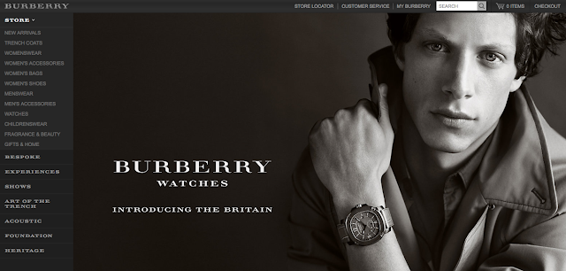


Apart from the Barbour logo, Alfred Dunhill and Burberry again flaunt a serif typeface for their logos and most of the body text. Repeatedly used throughout the research I've carried out so far, I want to try and steer away from this classic style of type, after all the brief is called 'Fashion Brand of the Future'.
I do have to bare in mind the fact that the brief asks for the brand to capture the qualities of Great Britishness, reflecting on the industrial revolution and other great achievements in the UK over the years.
I'm thinking about looking into a more industrial based body of research, feeding this into my design process and seeing how Britain really affected design and fashion from very early on.
There is still a running theme that I've noticed running throughout all of the major brands I've looked at so far. Simplicity. A very simple, clean cut style has been applied to all of the homepages and the content stays true to this style throughout browsing. A distinct lack of colour is apparent too, with two of these three opting for a predominantly black and white appearance. It's strange because I see fashion being as much about colour and texture as it is about style and finish, but I suppose it's more predominantly about class and finesse for the more exquisite brands and the black and white does deliver this quite effectively.


Apart from the Barbour logo, Alfred Dunhill and Burberry again flaunt a serif typeface for their logos and most of the body text. Repeatedly used throughout the research I've carried out so far, I want to try and steer away from this classic style of type, after all the brief is called 'Fashion Brand of the Future'.
I do have to bare in mind the fact that the brief asks for the brand to capture the qualities of Great Britishness, reflecting on the industrial revolution and other great achievements in the UK over the years.
I'm thinking about looking into a more industrial based body of research, feeding this into my design process and seeing how Britain really affected design and fashion from very early on.
Subconscious
Over the weekend, Oli and myself sat and watched a couple of episodes of 'Through the Worm Hole', a scientific documentary series hosted by Morgan Freeman. The episode that led me to write this was called 'Mysteries Of The Subconscious', it looks into our subconscious thought and how it allows us to make decisions and act in in ways that we wouldn't consciously choose.
It was the analysing of brain patterns and scientific results that got us thinking about how it could relate to the 'LOCO' brief we're both working on. Loco translates back to 'madness' and 'crazy', a state of mind that can often relate to club nights, particularly with deep electronic music.
Below are a few screen shots of the imagery used to analyse brain patterns when dealing with the conscious and subconscious. It immediately got me thinking about artwork for the club night as I'd already had an idea about dripping coloured squares representing the pattern and beats of the music, exampled in a design sheet on an earlier post.


It is definitely an idea that will stay in the main stream of our design practice, not necessarily keeping the same colour scheme or pattern formation, but the concept will relate back to the alteration of our state of mind (and how that can be recorded) when in club situations such as the one we're designing for.
12.10.12
Publications
Looking at existing publications, more particularly their production, binding and physical attributes. I want to experiment with more unusual techniques when producing my '80 Years on' publication, exploring typographic history in the 20's & 30's and how that has informed the use of type today.
 I swear I use no art at all
is the 101st published book by Joost Grootens. The concept is beautiful, it is simply a documentation of his past 100 books. A great selection of the grids, binds, images and content from his past projects are all included.
The first press was a run of 1000 limited editions, Grootens then tracked down as many of the 1000 books all over the world and produced an info graphic poster as to each of their where abouts, included in each of the books there after. Beautiful.
One thing I love about this book is the tiered sections throughout, essentially I think they are a progression of tip-ins all the way through, but it is a really functional way to divide content, especially in a book that is so focused on information and a record of past projects.

It was hard to miss this Exhibition booklet laying around college, but I thought I'd give it a little mention as it does use a fancy print finish and rather unconventional half cover, it's little experiments like this that I want to start incorporating into my publication, particularly as I want it to be more of a playful brief.

This next example is a hand made publication, I picked it up for £10 pound at the last Leeds book fair. It is a personalised graphic representation of a song by The Caseroom Press, it was quite a coincidence as we were sat next to them at the fair and our response was music related and we got talking about different projects and methods to visualising audio.
I love the simplicity of the content, no text, just visual compositions of a song completely determined by personal take on what it meant to them. The front cover is a large folding poster that can be accessed by taking the bind apart. I'm yet to make use of the poster as I can't bring myself to dismantle this lovely publication.

10.10.12
9.10.12
Ghurka
Ghurka are an American company supplying leather bags commonly used for hand luggage and general use. It's not particularly in my area of proposed research, although I couldn't help blogging it due to the use of a crest like logo. I couldn't ascertain how long they've been established for, but again they have an 'our heritage' link that suggests they may have been in the game for a while.
It seems as though these luxury brands like to make the fact that they have "heritage" very apparent, maybe in order to gain the buyers trust or just to seem as though they know what they're talking about, either way they have some really nice stuff, and they seem to be able to back up their crest style logo with some kind of reasoning as to its existence.


It seems as though these luxury brands like to make the fact that they have "heritage" very apparent, maybe in order to gain the buyers trust or just to seem as though they know what they're talking about, either way they have some really nice stuff, and they seem to be able to back up their crest style logo with some kind of reasoning as to its existence.


8.10.12
Luxury Labels
Looking at existing luxury menswear brands to get a feel for the kind of aestetic that is commonly found within the market. Although the brief explicity states an English style/feel is necessary, I want to also look at how european and overseas brands deliver themselves in order to attract the required audiences.
The word 'Luxury' can have many connotations, mainly expressing a level of quality and expense, but it can also depict a way of life, which is what the 35-50 year old male wants to aspire to. Clean-cut, crisp and elegant are all words found whilst looking at synonyms of the keywords provided on the brief and all can be seen in effect on most of the website/stores I've been looking at, exampled below...
SUNSPEL - UK


SUNSPEL - Established in 1980, pride themselves on their heritage and craftsmanship, and as soon as one enters their online presence it immediately rings Clean-Cut, Fresh and Quality, but above all it really does have an English feel to it. The Crest logo and the illustrated 'traditionally english' male character reinforce the English heritage.
Thinking 'English' could possibly cunduer up more traditional thoughts of red, white and blue - not at all to say that it is over used in any way amongst the English fashion industry, but colour can have a big influence on the tone of voice and overall image of a brand. Black and white with hits of natural colour work so well here, allowing focus on product and quality.
CROMBIE - UK


CROMBIE - are another UK born brand that are even more proud on the heritage side of things, something that seems to be a common occurance within luxury British brands. Established in 1805 they have a long history of making quality clothing, which resounds throughout the website. Another thing I've noticed is the use of serif typefaces within the logos of both brands above, and even more so the use of a crest.
The British are quite renound for our use of crests, with important, wealthy familes having their own crests for hundreds of years as a symbol of the aforementioned. Naturally this has stemmed into our businesses and brands in an attempt to keep the British affiliation.
I like the idea of crest logos, although the brief name itself almost contradicts the use of them; 'The Fashion Brand of the Future', sugesting that it should be resolved in a freshly thought out manor. I shalln't rule them out just yet but I won't be rushing to immitate this style with good reasoning.
PAUL SMITH - UK


PAUL SMITH - is another UK founded brand, grown from a little boutique in Nottingham over 40 years ago. Paul smith is now considerd the pre-eminent British designer, with over 14 stores here and 66 worldwide. Considered the epitome of British Fashion, it's reassuring to see more inviting and playful branding. I've always been a fan of Paul Smiths' identity with the multi-coloured stripes applied to swingtags, perfumes, packaging and so on. It is immidiately identifyable and very reassuring after looking into the two previous brands that have very little in the way of evocative and colourful identities.

The word 'Luxury' can have many connotations, mainly expressing a level of quality and expense, but it can also depict a way of life, which is what the 35-50 year old male wants to aspire to. Clean-cut, crisp and elegant are all words found whilst looking at synonyms of the keywords provided on the brief and all can be seen in effect on most of the website/stores I've been looking at, exampled below...
SUNSPEL - UK


SUNSPEL - Established in 1980, pride themselves on their heritage and craftsmanship, and as soon as one enters their online presence it immediately rings Clean-Cut, Fresh and Quality, but above all it really does have an English feel to it. The Crest logo and the illustrated 'traditionally english' male character reinforce the English heritage.
Thinking 'English' could possibly cunduer up more traditional thoughts of red, white and blue - not at all to say that it is over used in any way amongst the English fashion industry, but colour can have a big influence on the tone of voice and overall image of a brand. Black and white with hits of natural colour work so well here, allowing focus on product and quality.
CROMBIE - UK


CROMBIE - are another UK born brand that are even more proud on the heritage side of things, something that seems to be a common occurance within luxury British brands. Established in 1805 they have a long history of making quality clothing, which resounds throughout the website. Another thing I've noticed is the use of serif typefaces within the logos of both brands above, and even more so the use of a crest.
The British are quite renound for our use of crests, with important, wealthy familes having their own crests for hundreds of years as a symbol of the aforementioned. Naturally this has stemmed into our businesses and brands in an attempt to keep the British affiliation.
I like the idea of crest logos, although the brief name itself almost contradicts the use of them; 'The Fashion Brand of the Future', sugesting that it should be resolved in a freshly thought out manor. I shalln't rule them out just yet but I won't be rushing to immitate this style with good reasoning.
PAUL SMITH - UK
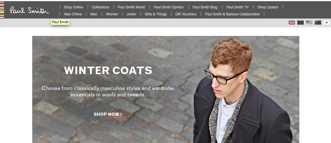

PAUL SMITH - is another UK founded brand, grown from a little boutique in Nottingham over 40 years ago. Paul smith is now considerd the pre-eminent British designer, with over 14 stores here and 66 worldwide. Considered the epitome of British Fashion, it's reassuring to see more inviting and playful branding. I've always been a fan of Paul Smiths' identity with the multi-coloured stripes applied to swingtags, perfumes, packaging and so on. It is immidiately identifyable and very reassuring after looking into the two previous brands that have very little in the way of evocative and colourful identities.

Past and Preent
I feel some of my research from the tail-end of last year could start to feed in to this particular brief, although the audience is very much more specific and the tone of voice is considerabley more formal, some of the posts could have great influence on the way I go around formulating and designing a luxury menswear label.
The 'Steady Guy' re-brand was greaty targetted towards a younger, still male, fashion orientated audience. A lot of the context I was looking at introduced some fresh and exciting concepts that may not usually be associated with 'Luxury Menswar'. I do however believe that incorporating the two could have some interesting results.

The key thing that keeps playing on my mind is the fact that the male audience I'm designing for have no particular interest in fashion so to speak, other than they want to look professional and clean-cut.
It is this idea of designing for an audience that may or may not have a thought-process regarding the concepts behind a brand or label that I want to penetrate, appealing to those who do whilst interesting and inviting those who don't.
The 'Steady Guy' re-brand was greaty targetted towards a younger, still male, fashion orientated audience. A lot of the context I was looking at introduced some fresh and exciting concepts that may not usually be associated with 'Luxury Menswar'. I do however believe that incorporating the two could have some interesting results.
The key thing that keeps playing on my mind is the fact that the male audience I'm designing for have no particular interest in fashion so to speak, other than they want to look professional and clean-cut.
It is this idea of designing for an audience that may or may not have a thought-process regarding the concepts behind a brand or label that I want to penetrate, appealing to those who do whilst interesting and inviting those who don't.
Defined
LUXURY
TAILORED
FRESH
DESIGN
CLEAN
Overview of noun luxury

The noun luxury has 3 senses (first 2 from tagged texts)

1. (5) luxury, extravagance -- (something that is an indulgence rather than a necessity)
2. (1) lavishness, luxury, sumptuosity, sumptuousness -- (the quality possessed by something that is excessively expensive)
3. luxury, luxuriousness, opulence, sumptuousness -- (wealth as evidenced by sumptuous living)

Overview of adj luxury

The adj luxury has 1 sense (first 1 from tagged texts)

1. (2) deluxe, de luxe, luxe, luxury -- (elegant and sumptuous; "a deluxe car"; "luxe accommodations"; "a luxury condominium")
| Affluence, Bliss, Comfort, Delight, Enjoyment, Exorbitance, Extravagance, Frill, Gratification, Hedonism, High living, Immoderation, Intemperance, Leisure. |
TAILORED
Overview of verb tailor

The verb tailor has 3 senses (first 2 from tagged texts)

1. (5) shoehorn, tailor -- (make fit for a specific purpose)
2. (1) cut, style, tailor -- (style and tailor in a certain fashion; "cut a dress"; "style a wedding dress")
3. sew, tailor, tailor-make -- (create (clothes) with cloth; "Can the seamstress sew me a suit by next week?")

Overview of adj tailored

The adj tailored has 2 senses (first 1 from tagged texts)

1. (3) tailored, trim -- (severely simple in line or design; "a neat tailored suit"; "tailored curtains")
2. bespoke, bespoken, custom, made-to-order, tailored, tailor-made -- (of clothing)
| Accommodate, Adapt, Alter, Conform, Convert, Custom-make, Cut, Cut to Fit, Dovetail, Fashion, Fit, Make to Order, Modify, Mold, Quadrate, Reconcile, Shape, Shape Up, Square, Style, Suit. |
FRESH
Overview of adj fresh

The adj fresh has 13 senses (first 5 from tagged texts)

1. (16) fresh -- (not stale or old; "fresh bread"; "a fresh scent")
2. (7) fresh -- ((of a cycle) beginning or occurring again; "a fresh start"; "fresh ideas")
3. (4) bracing, brisk, energizing, energising, fresh, refreshing, refreshful, tonic
4. (3) fresh, new, novel -
5. (2) fresh -- (not canned or otherwise preserved; "fresh vegetables")
6. fresh -- (not containing or composed of salt water; "fresh water")
7. fresh -- (having recently calved and therefore able to give milk; "the cow is fresh")
8. fresh, invigorated, refreshed, reinvigorated -- (with restored energy)
9. fresh, sweet -- (not soured or preserved; "sweet milk")
10. clean, fresh -- (free from impurities; "clean water"; "fresh air")
11. fresh -- (not artificial; "fresh cut flowers")
12. fresh, unused -- (not yet used or soiled; "a fresh shirt"; "a fresh sheet of paper"; "an unused envelope")
13. fresh, impertinent, impudent, overbold, smart, saucy, sassy --
Overview of adv fresh
| Beginning, Brand-new, Contemporary, Crisp, Current, Different, Gleaming, Glistening, Latest, Mint, Modern, Modernistic, Newborn, Now, Original, Radical, Raw, Recent, Sparkling, State-of-the-art. |
DESIGN
| Architecture, Arrangement, Blueprint, Chart, Comp, Composition, Conception, Constitution, Construction, Delineation, Depiction, Diagram, Doodle, Drawing, Dummy, Form, Formation, Idea, Layout, Makeup, Map, Method, Model, Outline, Paste-up, Pattern, Perspective, Picture, Plan, Scheme, Study, Tracery, Tracing, Treatment |
CLEAN
| Blank, Bright, Cleansed, Clear, Delicate, Elegant, Faultless, Flawless, Fresh, Graceful, Hygienic, Immaculate, Neat, Orderly, Pure, Simple, Spic and Span, Spotless, Squeaky, Stainless, Taintless, Tidy, Trim, Unblemished, Unspotted, Unstained, Vanilla, Washed, Well-kept, White |
Keywords
The 'Fashion Brand of the Future' brief asks for certain elements to be considered whilst designing, conceptually and physically...
"The concept must the unisex since we plan to start as a Menswear label but then expand into men's accessories, toiletries, leather goods and eventually women's wear.
Our customer base will initially be a professional male, approximately between the ages of 35-50. They will have a well paid job working office hours. He likes to be up to date on the latest gadgets, news and accessories but isn't concerned about fashion. His interests are in sport and outdoor activities. his needs for clothes are a good fit and quality items that look age appropriate. He wants something that can be used for work, social occasions since he will have personal responsibilities such as a family and a career."
KEY WORDS
Luxury • Menswear • British • Engineering • Tailored • Fresh • Clean • Design
I'm going to look into and expand on these words as a starting point to branch out from, I've found searching for synonyms and visualising certain keywords associated with a brief that it can trigger ideas at quite a fast pace, particulalry the nouns and adjectives.
5.10.12
Regimental
I want to introduce a more regimental structure to my tagging process this year. It's quite an obvious point to make however I don't want a mash of brief titles clogging up my posts and label selection and also to make it easier to identify my core briefs for the module. On top of the usual OUGD301, I am going to tag each brief as 301.1, 301.2 and so on, each representing the corresponding briefs.
I'm using this post as a point of reference to state which briefs correspond with the tag code;
301.1_Fashion brand of the future
301.2_80 Years on
301.3_Cymatics (collaboration with Matt Tucker)
301.4_Loco (collaboration with Oli Cassell)
I'm using this post as a point of reference to state which briefs correspond with the tag code;
301.1_Fashion brand of the future
301.2_80 Years on
301.3_Cymatics (collaboration with Matt Tucker)
301.4_Loco (collaboration with Oli Cassell)
Subscribe to:
Posts (Atom)