design for print, and not only design for print but design that is serving an everyday purpose.
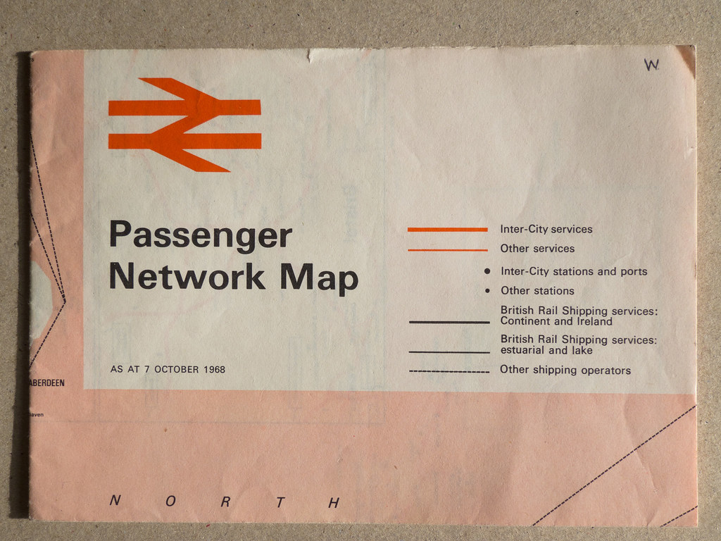
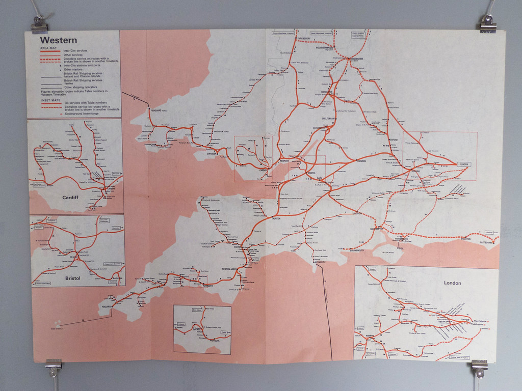
British Rail Passenger Network Map - 1968
This top example is most likely a 2 colour offset-litho process, using a halftone of the red
for the block areas, full red for the logo and track lines and black for the text. Process aside,
the typography, colour and strokes used throughout this map work on so many levels,
leaving me genuinely wanting to own a copy for my visual pleasure!
International Network Map - '79/80
Again unsre of the designer, but this time I believe it might have been a 3 colour process.
Using an extra blue to represent the surrounding water, the detail shot below examples
how crisp the print quality is and really gets my infographic head on.
There must have been a certain consideration towards the stock seing as it's to be constantly
folded in and out, wanting a heavy enough GSM to retain its stabilty but not so far it starts
to crack once folded.
I love the aged appearance of (once folded down) the front and back.


No comments:
Post a Comment