Showing posts with label Spot Colour. Show all posts

20.10.11

Oscillations

Ross Gunter designed this A2 poster to commemorate 1st birthday party and the
Oscillations album launch. Lithographically printed with 2 colours on 170gsm
100% recycled Cyclus Offset.


19.10.11

Identity

Benjamin Redington created these business cards By using overprint and was able to create a blue and yellow business card with the overlapping colors creating a third color, green. These cards were letter pressed and used the plates pictured below.


11.10.11

Kunsthalle Luzern.

Kunsthalle Luzern is an exhibition space in the middle of Luzern, Switzerland,
it encourages, presents and discusses contemporary art and design. This corporate
design from Type Fabric is quite fitted to the clients contemporary nature, I love
the simple use of 2 spot colours throughout the branding extending through to
the monotone photos.


6.10.11

Portland Firsts

 This map and poster from Paste in Place  announces Portland State University's lecture series for 2011-12. The map image and the lecture series information are organized on two distinctly colored layers. Both layers were overprinted to create a sense of depth and visual interest on top of keeping costing down.


4.10.11

Forty

Astronaught Design are one of my favoured design studios, I love everything that comes to find itself on their website. This branding and identity for FORTY is a beautiful combination of stock and spot colour. The red compliments the grey realy well and is most likely a specified pantone so the company can keep their identity fluent.


2.10.11

Fashion Week


Schampus

This quarterly magazine for Schampus designed by Bergmann Studios has a very strong
focus on layout and colour. Using only 2 spot colour throughout this publication, it
effectively manages to differentiate between sections of text and image keeping the cost of
the job affordable but in no way bland.
The monochrome imagery keeps the colour theme consistent and again effectively
communicates the imagery whilst keeping the price down.


Stedefreund

CATRIN SONNABEND designed this flyer for Stedefreund, Berlin, 2010 - three exhibitions
exhibiting a comprehensive abstract series from the Berlin gallery.

Depending on the quantity produced I would want to say it has been offset litho, using two
spot colours, however depending how big the event was it could have easily been a small
digital print job, again an attention would have ben payed to the stock ensuring a cost
effective and easily foldable paper was chosen.

25.9.11

Rail Network Mapping

Unsure of the designers, but these Network Rail passenger maps are exquisite examples of
design for print, and not only design for print but design that is serving an everyday purpose.

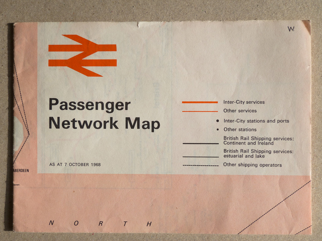
British Rail Passenger Network Map - 1968

This top example is most likely a 2 colour offset-litho process, using a halftone of the red
for the block areas, full red for the logo and track lines and black for the text. Process aside,
the typography, colour and strokes used throughout this map work on so many levels,
leaving me genuinely wanting to own a copy for my visual pleasure!


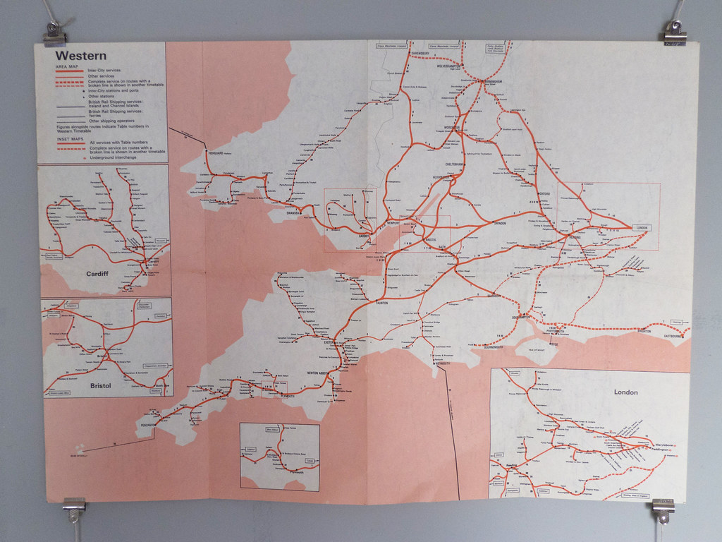
International Network Map - '79/80

Again unsre of the designer, but this time I believe it might have been a 3 colour process.
Using an extra blue to represent the surrounding water, the detail shot below examples
how crisp the print quality is and really gets my infographic head on.

There must have been a certain consideration towards the stock seing as it's to be constantly
folded in and out, wanting a heavy enough GSM to retain its stabilty but not so far it starts
to crack once folded.

I love the aged appearance of (once folded down) the front and back.