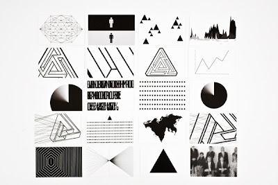
Very tidy design work, constantly experimenting with stock, page layout and composition throughout the publication. Some clever thinking has gone into producing such a barely legible logo, which tops off the quality of the identity...
"The poor legibility of the logo works as a metaphor for the
New World Order: it is everywhere, but you can’t understand it, it is in front of you but you need a deeper sight to spot it."
New World Order: it is everywhere, but you can’t understand it, it is in front of you but you need a deeper sight to spot it."
A vast selection of shots from the publication are availiable from Meloni's behance profile, it was painstaking to choose a quality selection as every page is as crisp as the last.


No comments:
Post a Comment