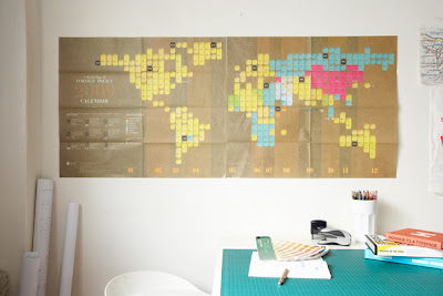
Some top notch design circulating through this calendar, rich use of colours and textures provide intriguing visuals. An appropriate theme to take given it's focued towards moving location, I'm really taken by the use of the airport style travel tag as the packaging design, genius.
Showing posts with label OUGD103. Show all posts
Showing posts with label OUGD103. Show all posts
22.5.11
THE FOREIGN POLICY 2009 WORLD CALENDAR,
More self self-promotional projects, this time communicating the existence and arrival of The Foreign Policy Design Group to the fresh country of Singapore from New York City and leveraging on the name "Foreign Policy". The projects content is a blend of current affairs, political affairs, maps, the world and the leaders.
Some top notch design circulating through this calendar, rich use of colours and textures provide intriguing visuals. An appropriate theme to take given it's focued towards moving location, I'm really taken by the use of the airport style travel tag as the packaging design, genius.
Some top notch design circulating through this calendar, rich use of colours and textures provide intriguing visuals. An appropriate theme to take given it's focued towards moving location, I'm really taken by the use of the airport style travel tag as the packaging design, genius.
21.5.11
13.5.11
Speaking from experience,
Wall planner,
I managed to get my virtual hands on these wall-planers for 2012. Will undoubtedly come in useful when designing the layout of the year planner printed onto the card sheets.
11.5.11
Speaking from experience,
Anatomy of type,
As typography has such an extensive glossary it would be hard to incorporate every term and definition into easily digestible chunks (seeing as one of the main problems is a distinct bombardment of the aforementioned). This said I shall look at as much terminology as I can and decide from there what to take forward and start designing content for.
In order to determine the selection, I might put it to the members of the course. Maybe look at finding the most well known (easiest to grasp) terms amongst the group, and from there focus on the terms that arent so prominent in peoples minds?
In order to determine the selection, I might put it to the members of the course. Maybe look at finding the most well known (easiest to grasp) terms amongst the group, and from there focus on the terms that arent so prominent in peoples minds?
9.5.11
Speaking from experience,
Calendar design,
Everlasting Adhesive Calendar
Originally created as a promo gift by designers Ivana Vucic and Orsat Frankovic, this roll of tape can function as an organizer, planner, post-it, tape, or sticker. A separate roll of 'days' comes with the main roll, allowing users to specifically adjust the tape to the time they need it, wherever that may be.
Although considering this method probably wouldn't influence my current design process greatly, I don't want to dismiss any innovative design as it could benefit at any time.
Aplina Paint Wall Calendar
I really love this response from SCHOLZ & FRIENDS for a brief set to develop an advertising medium to communicate the 'colour of the month'. It is simply a giant calendar 3Mx2M to be precise, each page revealing a freshly painted colour, showing how great these fresh colours look. Not only showcasing for advertising purposes in furniture and hardware stores, it also made a couple of appearances at selected art galleries.
Again, this isn't a particularly appropriate scale or theme for what I am trying to achieve, but I want to explore the concept of the 'calendar' in full, and wouldn't be doing myself any favours by dismissing any design.
Porta Alegre Calendar
A less eccentric design here from Grazielle Bruscato Portella. The concept simply works with stickers, 'sticker of the day', discovering what is behind the number, ironically a window or a door from the city of poto alegre. After browsing his Flickr profile, Portella has a vast library of images documenting the city, I'm sure the quirkier windows and doors made the calendar/poster design. When the year is finished, it produces the poster with all the images organized by colours creating an overall gradient.
Speaking from experience,
Typographydeconstructed,
I have posted about this website before, a really good source for typographic information and generally anything to do with type. They have created some really crisp examples of where the terminoligy is used and even put it all together in a beautiful poster for our buying pleasure!
Speaking from experience,
Anatomy of type,
After fully deciding on a concept to push forward for this brief, I went back to basics and started looking at the anatomy of type. I know I had difficulty getting my head to grips with all the terminoligy, even today I couldn't reel off more than half of the names used within typography. It is my hope to not only produce a graphical response to help future students, but also reinforce my knowledge in the process.
These are a few images i found browsing google for 'anatomy of type'
In the last example, the term 'pylon' has been used to describe the missing areas of a stencil typeface.
These are a few images i found browsing google for 'anatomy of type'
In the last example, the term 'pylon' has been used to describe the missing areas of a stencil typeface.
18.3.11
Design is a VIRUS,
Cardboard flyers,
After browsing context for 'what is a line' I came across these cardboard flyers promoting broadband. With the slogan "It's so good, there wasn't much left to make this any fancier." We're looking at producing cardboard flyers to promote 'DO DAY', they definitly come across more visually engaging and physically move away from the average glossy flyer.
14.3.11
Design is a VIRUS,
Initial ideas,
Whilst we were looking at inspirational material to aim at 9-5 workers, we wanted to encorporate an element of scare tactics into our campaign. Through this I discovered a government official .pdf covering almost all areas of work related issues regarding peoples health both physically and mentally. Although we didn't persue this idea, the .pdf could have been extremely useful in aiding us pin point where work related issues are most frequent, helping us target a relevant audience.
12.3.11
Design is a VIRUS,
Initial ideas,
Calendar research.
WALL Calendar (description from Behance network)
"A promotional calendar for Spicers, an Australian paper merchant. Following the thought that the highest compliment you can pay a calendar is to actually put it up on your wall, the visual narrative of the calendar explored the different things people put on their walls.
Four photographers, one for each season, were invited to respond to this idea, and their very diverse responses were printed on different papers that Spicers stocks, with custom typographic statements preceding each ‘chapter’ of the calendar. The entire piece was left loose, unbound, and folded down and packed between 2 embossed pieces of boxboard, held together with a rubber band."
A flip book calendar/diary. Works nicely as a moving image but becomes even more relevant as the weeks and months and seasons tally with the tree, be it blossoming or shedding its leaves.
Bodoni Typographic Calendar by Victoria Pater.
Experimenting with various typographic techniques, variants and compositions. Simple black and white but when bought together with the red really brings the set together. Acquiring a visual identity and sealing it as a crisp, professional design.
10.3.11
Cardboard USB,
As part of a proposal for our current 'Design is a Virus' brief, the concept of these cardboard USB sticks became an integral part of our idea to promote people doing somehting new.
As they are only conceptual at this time, we needed to be able to realise a resolution, throwing the idea out the window...
As they are only conceptual at this time, we needed to be able to realise a resolution, throwing the idea out the window...
9.3.11
Visual language,
What is a line?
Always having a big passion for working with cardboard and getting into hands-on projects, this brief has given me the opportunity to explore 'line' in anyway I see fit. These card-board creations focus purely on the compositional make up of simple cardboard shapes. In order for me to have a decent amount of research to produce my response in such a way, I'm going to look at modern architecture; photoshoping, scanning and manipulating imagery to see where I end up.
Heere.
Heere.
4.3.11
Design is about doing,
Letter, Word, Sentence, Paragraph,
Oxymorons,
looking at witty oxymorons that I could use as focus for my set of posters, accompanied by relating imagery...
/Constant change
/Linier curve
/Organised mess
/Oven fried
/Pure evil
/Modern classic
/Top floor
/Inside out
/Amateur expert
/Easy task
/Office party
/Unique uniform
/Mobile station
/Science fiction
/Constant change
/Linier curve
/Organised mess
/Oven fried
/Pure evil
/Modern classic
/Top floor
/Inside out
/Amateur expert
/Easy task
/Office party
/Unique uniform
/Mobile station
/Science fiction
2.3.11
Design is about doing,
Letter, Word, Sentence, Paragraph,
Opposites,
Oxymoron – noun, plural
, ox·y·mor·ons. Rhetoric -
, ox·y·mor·ons. Rhetoric -
a figure of speech by which a locution produces an incongruous, seemingly self-contradictory effect, as in “cruel kindness” or “to make haste slowly.”
Thinking about visual oxymorons to start incorporating into poster designs, here a few images I found that portray this concept...
Subscribe to:
Posts (Atom)


