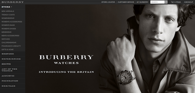
Continuing to look at the online presence of British fashion brands, the three below are very well known and renowned brands within the UK, not only for men but also female wear as well.
There is still a running theme that I've noticed running throughout all of the major brands I've looked at so far. Simplicity. A very simple, clean cut style has been applied to all of the homepages and the content stays true to this style throughout browsing. A distinct lack of colour is apparent too, with two of these three opting for a predominantly black and white appearance. It's strange because I see fashion being as much about colour and texture as it is about style and finish, but I suppose it's more predominantly about class and finesse for the more exquisite brands and the black and white does deliver this quite effectively.
Apart from the Barbour logo, Alfred Dunhill and Burberry again flaunt a serif typeface for their logos and most of the body text. Repeatedly used throughout the research I've carried out so far, I want to try and steer away from this classic style of type, after all the brief is called 'Fashion Brand of the Future'.
I do have to bare in mind the fact that the brief asks for the brand to capture the qualities of Great Britishness, reflecting on the industrial revolution and other great achievements in the UK over the years.
I'm thinking about looking into a more industrial based body of research, feeding this into my design process and seeing how Britain really affected design and fashion from very early on.


No comments:
Post a Comment