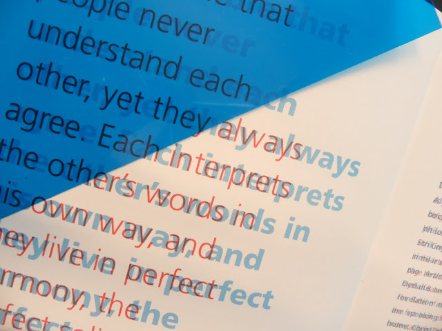
This is a book from my collection that links back to a similar post on my context in which
the same concept of overprinted text is used. The book has a heavy focus on 'communication'
and looks at various projects concerning the theme.
The use of blue and red (although missing from the book) acetate cleverly allows the same
passage written on the same page in two different fonts, to become legible in either style
placed over the page. A beautiful technique to accompany a book concerning the issue of
communication.
Showing posts with label Editorial. Show all posts
Showing posts with label Editorial. Show all posts
23.10.11
11.10.11
9.10.11
Black & White
A book from my shelf that uses a debossed black print as the sole artwork for the front cover. I love the simple use of black and white, which extends all the way through the publication, showing a dedication to raw design. I love the type and even more so the image used for this A5 sized case bound publication
4.10.11
Wrap
Very complex design for Wrap magazine, unsure of the designer but its a good example of overprint used alongside image.
2.10.11
Schampus
This quarterly magazine for Schampus designed by Bergmann Studios has a very strong
focus on layout and colour. Using only 2 spot colour throughout this publication, it
effectively manages to differentiate between sections of text and image keeping the cost of
the job affordable but in no way bland.
The monochrome imagery keeps the colour theme consistent and again effectively
communicates the imagery whilst keeping the price down.
1.10.11
PR∆SM
This autmn/winter collection zine for PRISM clothing is a typical example of promotional
material circulating in the fashion world. NEO NEO designed this particular edition along
with a promotional poster that had a rather contrasting style.
CMYK process and A4 format with a simple saddle stitch bind, not a lot of costing has gone
into the process but it serves its purpose well.
material circulating in the fashion world. NEO NEO designed this particular edition along
with a promotional poster that had a rather contrasting style.
CMYK process and A4 format with a simple saddle stitch bind, not a lot of costing has gone
into the process but it serves its purpose well.
Subscribe to:
Posts (Atom)


