Generation press came in for a visit, the presentation lasted a while but was filled with nothing but absolute design gold. Paul and Anand bought along an abundance of ridiculously gorgeous printed design, more stocks and finishes than I could comprehend in one afternoon. I got a load of photos but not nearly a full documentation of what was there to get our hands on.
Showing posts with label Task 4. Show all posts
Showing posts with label Task 4. Show all posts
11.11.11
9.11.11
TED
This interactive design is not exactly the level of deatail I wasthinking about incorporating into my colour guide booklet, although the concept of a pull out leaf, changing as its put inot action. My design will be focues around colour shift opposed to typography, but I was so amazed by the video it hasd to be blogged. The rest of the material produced for this project is really crisp too, particularly the accompanying poster and packaging.
28.10.11
DIG for FIRE
Identity and paper goods design for music video production company, Dig
for Fire. The full set is shown and contains DVD sleeves/mailers, sleeve
stickers, labels, notecards+envelopes, letterhead, business cards,
stamps and decals. All pieces mix-and-match well for a plethora of
potential uses. The hand-assembled packages give the feeling of a gift
for the recipient, with a layering of different materials and textures.
23.10.11
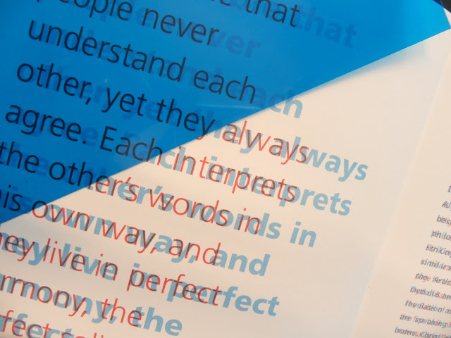
Babel
This is a book from my collection that links back to a similar post on my context in which
the same concept of overprinted text is used. The book has a heavy focus on 'communication'
and looks at various projects concerning the theme.
The use of blue and red (although missing from the book) acetate cleverly allows the same
passage written on the same page in two different fonts, to become legible in either style
placed over the page. A beautiful technique to accompany a book concerning the issue of
communication.
19.10.11
Identity
Benjamin Redington created these business cards By using overprint and was able to create a blue and yellow business card
with the overlapping colors creating a third color, green. These cards
were letter pressed and used the plates pictured below.
Subscribe to:
Posts (Atom)


